A History of Embarrassing Presidential Campaign Logos
Good design and presidential politics do not often meet.
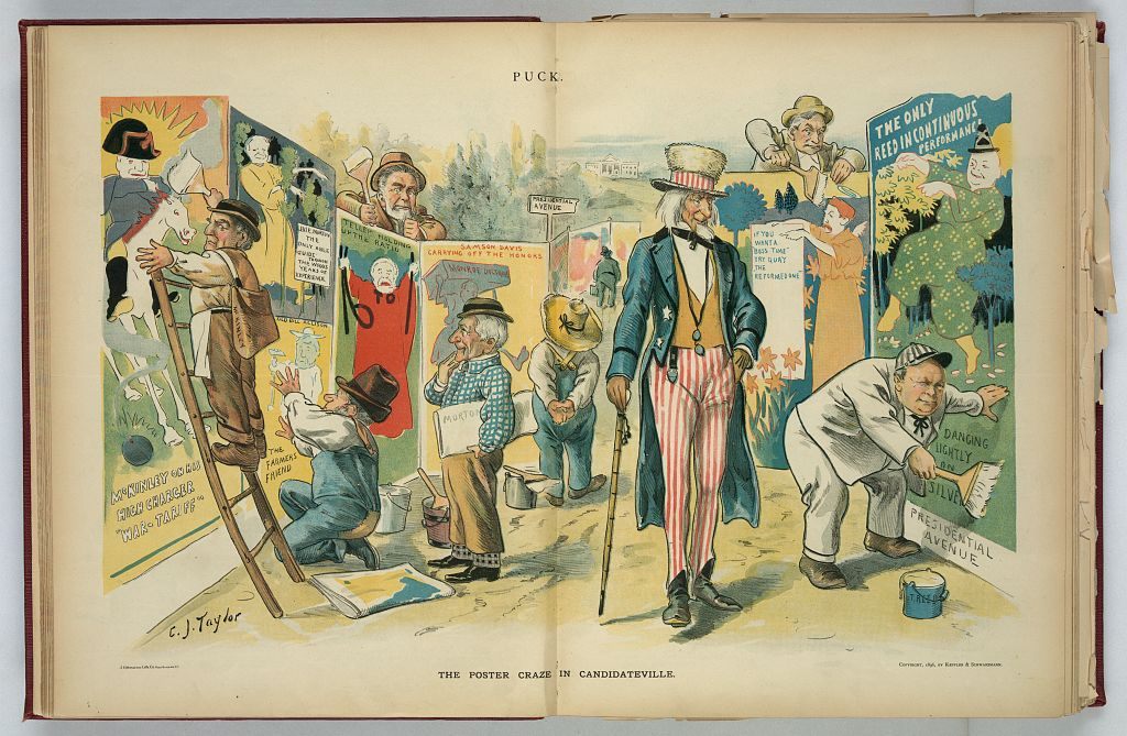
“The poster craze in candidateville,” an 1896 political cartoon by C.J. Taylor. (Photo: Library of Congress / LC-DIG-ppmsca-28889)
Every four years, American backyards, TV screens and now mobile phones are filled with tiny reminders that presidential politics and great graphic design do not often meet.
Current trends favor some amount of brevity. Beginning with Barack Obama’s widely-recognized 2008 campaign logo, a polished, professionally designed, preferably initials-only emblem has seemingly become de rigeur for U.S. presidential campaigns.
Presumptive Republican nominee Donald Trump’s logo followed this pattern, although its release on Friday, unveiled in tandem with the candidate’s announcement of his running mate, Indiana Governor Mike Pence, generated more conversation. While his opponent Hillary Clinton’s logo received a decidedly mixed response when it debuted last year, the criticisms pale in comparison to the negative reaction the Trump/Pence logo has received, with many critics taking the opportunity to make innuendo-laden remarks about the intersection of Trump and Pence’s initials.
But this year’s Republican nominee is hardly the first to create promotional material laden with peculiar design choices. Since the 19th century, presidential campaigns have produced posters, buttons, banners, and slogans to promote their candidate, and while a few have become iconic symbols of their eras—think Eisenhower’s “I Like Ike” slogan—there’s been more than a few unusual choices along the way.
A Man of the People (Or Something)
Perhaps inspired by Andrew Jackson’s successful leveraging of popular appeal to win the presidency in 1828, campaign operations in the following decades often worked to portray their candidate as a hard-working “man of the people.” To modern eyes, some of the efforts come across as gimmicky at best.
First, we have Whig candidate William Henry Harrison, who in 1840 integrated his party’s commoner-centric “log cabin” imagery into what some consider the first modern political campaign.
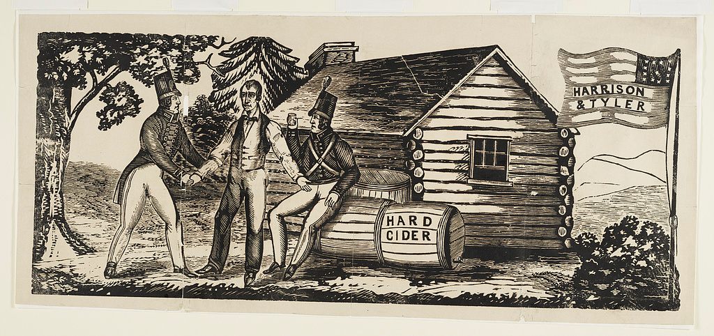
“Harrison & Tyler” campaign emblem, 1840. (Illustration: Library of Congress / LC-DIG-ds-00706)
Basically, Harrison ran on an image of being the guy who will invite you into his log cabin for hard cider; the original “candidate you’d like to have a beer with.” The Whigs also played up Harrison’s military service_the source of the “Tippecanoe and Tyler too” slogan—and the combination of popular appeal, decorated service, and careful avoidance of controversial issues like slavery allowed Harrison to win the election.
Ohio farm boy James Garfield similarly used the “common man” image to ascend to the presidency. An 1880 Currier & Ives print depicted this quite literally, showing a muscle-bound Garfield swinging a scythe of “honesty, ability, and patriotism” to cut a path to the White House, trampling the snakes of calumny, falsehood, and fraud along the way. If nothing else, the image demonstrates that campaign materials have lacked subtlety for over a hundred years.
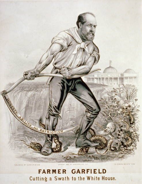
Farmer Garfield: Cutting a swath to the White House, 1880. (Illustration: Library of Congress / LC-USZC2-2317)
America’s manliest president, Teddy Roosevelt, lacked the humble upbringing of Garfield and Harrison, instead leaning on his military service and time in the American West to craft an image of courageous masculinity.
Roosevelt was never shy about his service with his “Rough Riders” in the Spanish-American War, and several photographs of Roosevelt during the war are well-known.
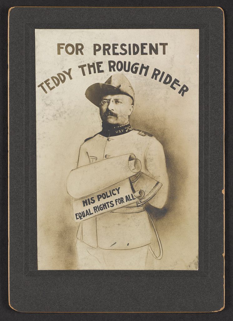
For President Teddy the rough rider, his policy equal rights for all, 1904. (Illustration: Library of Congress / LC-DIG-ppmsca-36697)
Which is why this poster, which might best be described as “1904’s version of terrible Photoshop editing,” feels like an attempt at promoting Roosevelt’s military image that doesn’t quite work out.
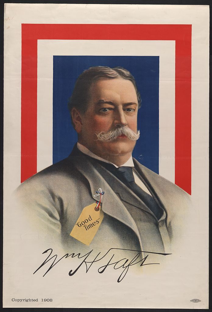
Wm. H. Taft - “good times”, 1908. (Illustration: Library of Congress / LC-DIG-ppmsca-10590)
Finally, we have this 1908 poster of Roosevelt’s successor, William Howard Taft. Taft, who was born into a middle-class Ohio family and was known more for his dedication to academic pursuits and legal work than the derring-do of his predecessor, is pictured here wearing a label or price tag of some sort that reads “Good Times.” In the catalog of mythologizing candidates as a campaign strategy, this is probably one of the less successful efforts.
Well, That’s Technically a Slogan
Trump’s “Make America Great Again,” deliberately evokes Ronald Reagan’s 1980 campaign slogan “Let’s Make America Great Again.” While Reagan’s campaigns demonstrated a widely-acknowledged mastery of political messaging, many, many candidates—both successful and failed—didn’t share the Gipper campaign’s aptitude for sloganeering.
Most relevant to Friday’s logo analysis, the 1852 election saw Franklin Pierce promising America, “We Polk-ed You in ‘44. We Shall Pierce You in ‘52.” Pierce, considered a longshot for the presidency, hoped that by associating himself with James Knox Polk, another dark horse who ended up a very popular president, voters would be convinced that another vote for the underdog would lead to another prosperous four years. Surprisingly, the weirdly aggressive slogan worked.
Anecdotally, President William McKinley famously ran for re-election in 1900 on the strangely uninspiring slogan “Let Well Enough Alone,” alluding to a first term marked by economic growth, swift victory in the Spanish-American War, and the acquisitions of Puerto Rico, Guam, the Phillippines, and Hawaii. Ironically, although McKinley won the election, he was assassinated in 1901.
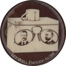
Teddy Roosevelt’s “meh” pin. (Photo: Political Memorabilia/Public Domain)
Even more ironically, collectors of political memorabilia have unearthed a campaign button that suggests that his vice-president and successor Teddy Roosevelt was the one who actually used the slogan (or perhaps re-used it) when he ran in 1904, having served his first term as an elevated vice-president. In that context, the slogan definitely carries a connotation of, “Well, you didn’t actually elect me, but everything is fine, so let’s just go with it, OK?”
F for Effort
Obama’s 2008 logo definitely set the standard for initial-based campaign logos, but his campaign didn’t invent the concept. Earlier in the 20th century, a few candidates attempted logos that might remind you of some you’ve seen in this election cycle—for better or for worse.
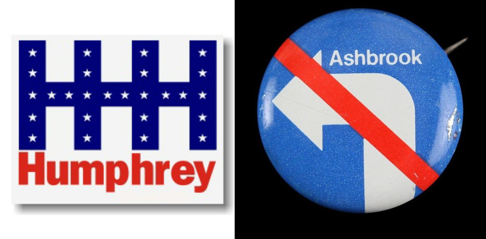
Two predecessors to Clinton. (Photo: Public Domain and Mears Online Auctions)
For instance, Hillary Clinton’s “H” logo has a predecessor in 1968 Democratic candidate Hubert Humphrey’s “triple-H” logo—although given the tumultuous events of the 1968 Democratic nomination contest, it’s not likely to be an association Clinton’s campaign is eager to see brought up. Similarly, Clinton isn’t the first candidate to use an arrow. That honor belongs to 1972 contender for the Republican nomination, John M. Ashbrook, whose logo includes a left-pointing arrow with a superimposed “No” symbol, meant to portray Ashbrook as the only Republican not “turning leftward” politically. Unfortunately, his campaign buttons made it appear as if the “No” symbol applied to both the left turn and his name.
Another ‘72 also-ran, Democrat Vance Hartke, featured illustrations of a heart and a key on his logo, presumably to teach his supporters how to pronounce his name. At the Democratic National Convention that year, Hartke received one electoral vote.
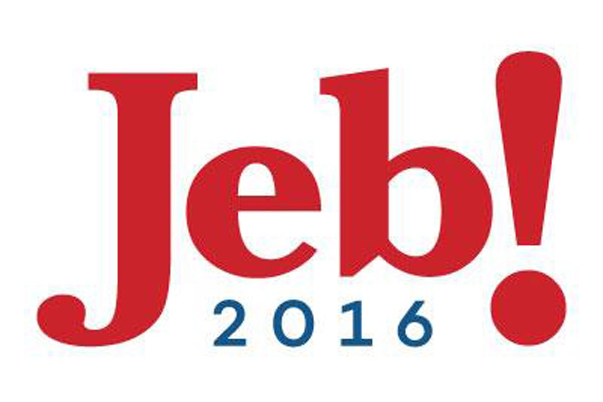
Ill-fated. (Photo: Jeb Bush)
Finally, it’s understandable to think Trump competitor John Ellis “Jeb!” Bush was the first to include an ill-advised exclamation point in his logo, given the pummeling he took in the media for it. But Jeb! has company in 1996 Republican-nomination-seeker Lamar! Alexander. In fact, Republican senator and 1996 presidential candidate Bob Dole shared a similar affinity for punctuation. Both his 1980 and 1988 attempts to seek the Republican nomination involved a logo that read, “Bob Dole. President.”
Of course, just a day after Trump’s ill-advised logo made its debut, the campaign has quietly replaced it with a more traditional, initials-free variation. But while the gaffe may stay fresh through November, it will fade into embarrassing campaign history sooner or later.


Follow us on Twitter to get the latest on the world's hidden wonders.
Like us on Facebook to get the latest on the world's hidden wonders.
Follow us on Twitter Like us on Facebook