How a Retro-Futurist Spends 3 Days in L.A.
Author Geoff Manaugh shares his picks for Three Obscure Days in Los Angeles.
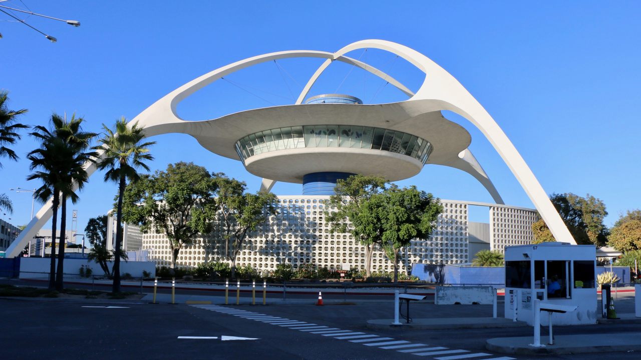
The feeling begins as soon as you land at LAX and find yourself greeted by the Theme Building. Somehow, you’ve entered a place where the past and the future coincide to create an uncanny present, equally influenced by nostalgia and futurism.
Geoff Manaugh, creator of BLDGBLOG and the author of A Burglar’s Guide to the City, is an architecture and design-focused writer and educator with a particular interest in a style colloquially referred to as “retro-futurism.” Broadly, retro-futurism refers to the exploration of outdated visions of the future. The Theme Building is a perfect example of the concept.
“It was designed when airports were as futuristic as Richard Branson’s ‘spaceport’ in the New Mexico desert is today,” Manaugh explains. These days, the complex appears charmingly Jetsons-esque.

Though the practice of predicting and designing for the future has existed for as long as recorded history, in Los Angeles it’s often associated with the 20th-century economic boom that gave the city its boost to the global stage.
With input from Manaugh in addition to a few suggestions of our own, we’ve put together a three-day itinerary to guide your exploration of Los Angeles’ most intriguing retro-futurist gems as part of a new feature, Three Obscure Days.
Whether you’re architecturally inclined or simply curious about Los Angeles’ idiosyncratic design, visiting these forward-thinking relics will leave you with a new perspective on the city’s past, present, and (retro-)future.
Day 1 Agenda:
-
Behold the Bradbury Building’s stunning interior
-
Venture down to the L.A. River bed
-
Explore the Westin Bonaventure’s unusual concrete interior
-
Pay a visit to the steamship-shaped Coca-Cola building

The Bradbury Building
Begin at one of the earliest examples of retro-futurism in Los Angeles. Opened in 1893, the Bradbury Building’s ordinary facade cloaks one of the most extraordinary interiors in the world. Topped by a glass roof, the interior court’s ornate details and ambitious scale are hewn from a variety of architectural styles, leaving the impression that the space is both of a bygone era and a future that has yet to come.
This feeling was not lost on the set designers of Blade Runner. Released in 1981 and set in Los Angeles in 2019, the film itself is a retro-futurist artifact. As the atmospheric home of one of the film’s central characters, The Bradbury Building is prominently featured in the film and has come to be closely associated with its vision of the future.
Blade Runner associations aside, the Bradbury Building has always had a relationship with retro-futurism. Manaugh cites a passage from science fiction author Edward Bellamy’s 1888 novel Looking Backward that describes a structure in the year 2000: “I was in a vast hall full of light” Bellamy wrote, “received not alone from the windows on all sides, but from the dome, the point of which was a hundred feet above.” The book is thought to have inspired Bradbury Building architect George Wyman.
“It seems to represent a vision of architecture that didn’t move forward,” Manaugh says of the Bradbury Building. The building’s failure to influence architecture is precisely what makes it an exemplar of retro-futurism.

Los Angeles River
Near the Bradbury Building in downtown Los Angeles, one can access the Los Angeles River. You would be forgiven for picturing the L.A. River as something that it isn’t. Spanning 48 miles across the county, the L.A. “River” is a colossal concrete structure actually built to contain the river and prevent flooding in the city.
A popular filming location for its dystopian appearance, the L.A. River’s history also presents a curious view of the future. In the 1930s, Los Angeles was plagued by a series of unpredictable floods. After a catastrophe that killed over 100 people in 1938, the U.S. Army Corps of Engineers were enlisted to take on the epic challenge of protecting the city’s citizens.
The undertaking was a feat of alien proportions that challenged notions of what human beings were capable of achieving. But in the years since, the forward-thinking, technological marvel has become an outdated relic of an era when environmentalism was of little concern. In recent years, plans to improve the area’s ecological footprint have gained traction, ushering in a new era of development for the L.A. River.

Westin Bonaventure
Despite being the largest hotel in Los Angeles, it’s easy to overlook the Westin Bonaventure on downtown Los Angeles’ skyline. Unlike many exemplars of retro-futurism, its appearance aligns with a look that came to dominate cityscapes in the latter part of the 20th century. But as the Bradbury Building demonstrates, facades can be deceiving, and in the Westin Bonaventure’s case, this was likely intentional.
Designed in 1976 by John C. Portman, Jr. (an architect and developer known for his work in office buildings and hotels), the Westin Bonaventure came to be a favorite subject of critical theorists because of its strategic design.

For the postmodernist critic Frederic Jameson, the Bonaventure represented an architectural attempt to both keep the world out and to contain it within itself. “Now one would want rather to stress the way in which the glass skin repels the city outside,” he wrote in Postmodernism, or, The Cultural Logic of Late Capitalism. Meanwhile, the amenities, commercial business spaces, and vast, winding, concrete throughways discourage visitors from leaving.
Manaugh cautions against viewing all representations of retro-futurism as idealistic. Constructed at a time when Los Angeles was undergoing an economic downturn and residents were fleeing to the suburbs, the Bonaventure’s design presents a grim vision of the future. But given that its presence is better felt in literary circles than on construction sites, the Bonaventure is a fascinating place to visit to contemplate a future that, thankfully, never came to be.
Coca-Cola Building
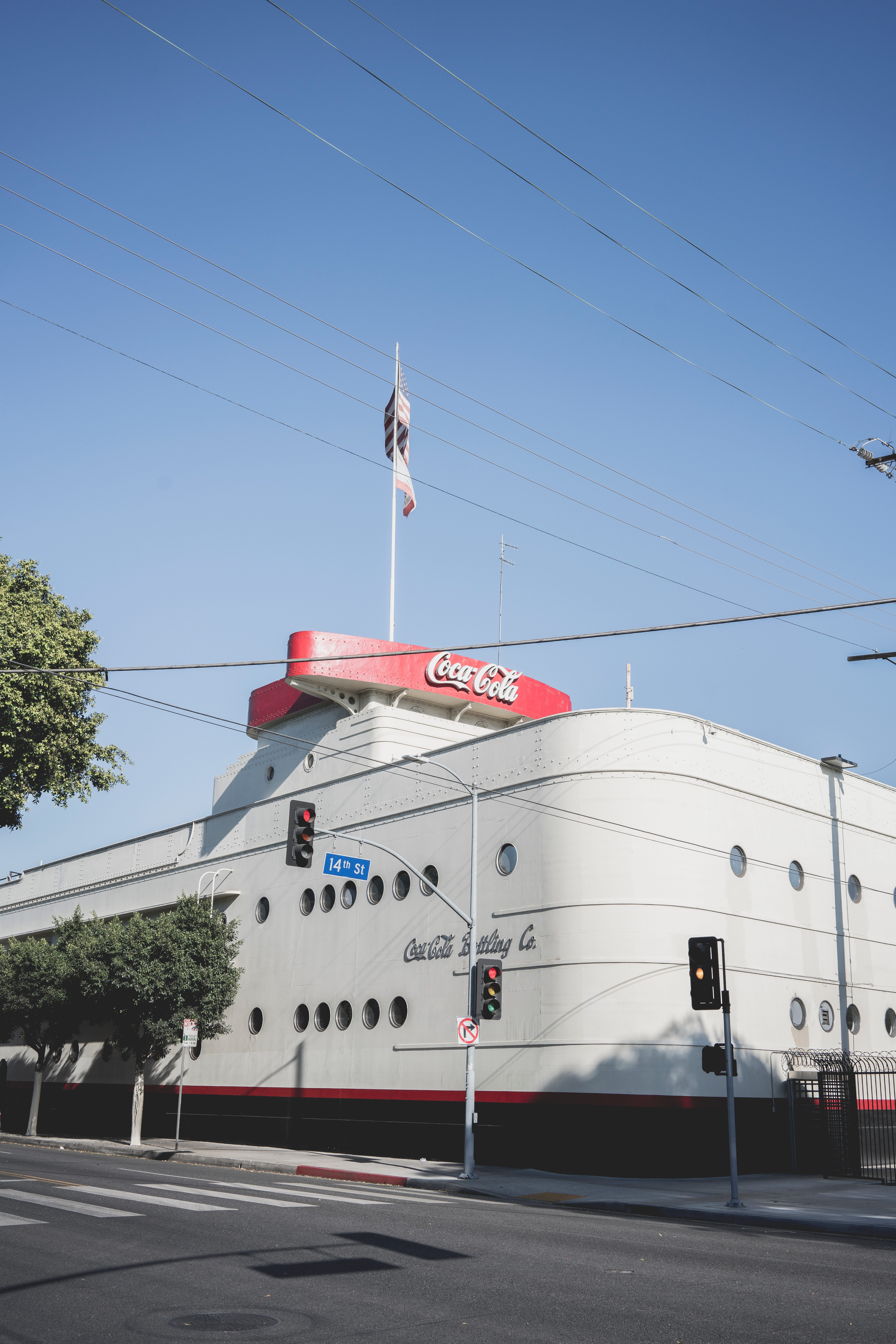
Heading to the downtown area’s outskirts, one is struck by the sight of a dry-docked steamship. Constructed to mimic a luxurious sea vessel, the Coca-Cola Building is an example of Streamline Moderne architecture, a late form of Art-Deco that sometimes employed nautical touches. Beyond this association, the reason for the bottling plant’s shape is perfectly puzzling.

Conceived in 1939—a year that film scholars often cite as the year that cinema reached its zenith—Manaugh offers a Hollywood connection to help make sense of the building’s form.
“This building is playing a steamship,” he reasons. “The phenomenon of creating buildings to appear as something that they aren’t, he continues, ‘is part of what makes the city so inspiring. You can be whatever you want here—even the buildings are in on it.’
Manaugh also points to an economic utility in the notion of fakeness. Buildings, street corners, and stretches of land that appear out-of-place in Los Angeles make for attractive shooting locations for cash-strapped filmmakers.
Day 2 Agenda:
-
Hunt for rocket parts at Norton Sales, Inc.
-
Shop for stylish Midcentury wares at MIDCENTURYLA
-
Have a pool-side cocktail at Viviane
-
Visit the Union 76 (“Googie”) gas station
Norton Sales, Inc.
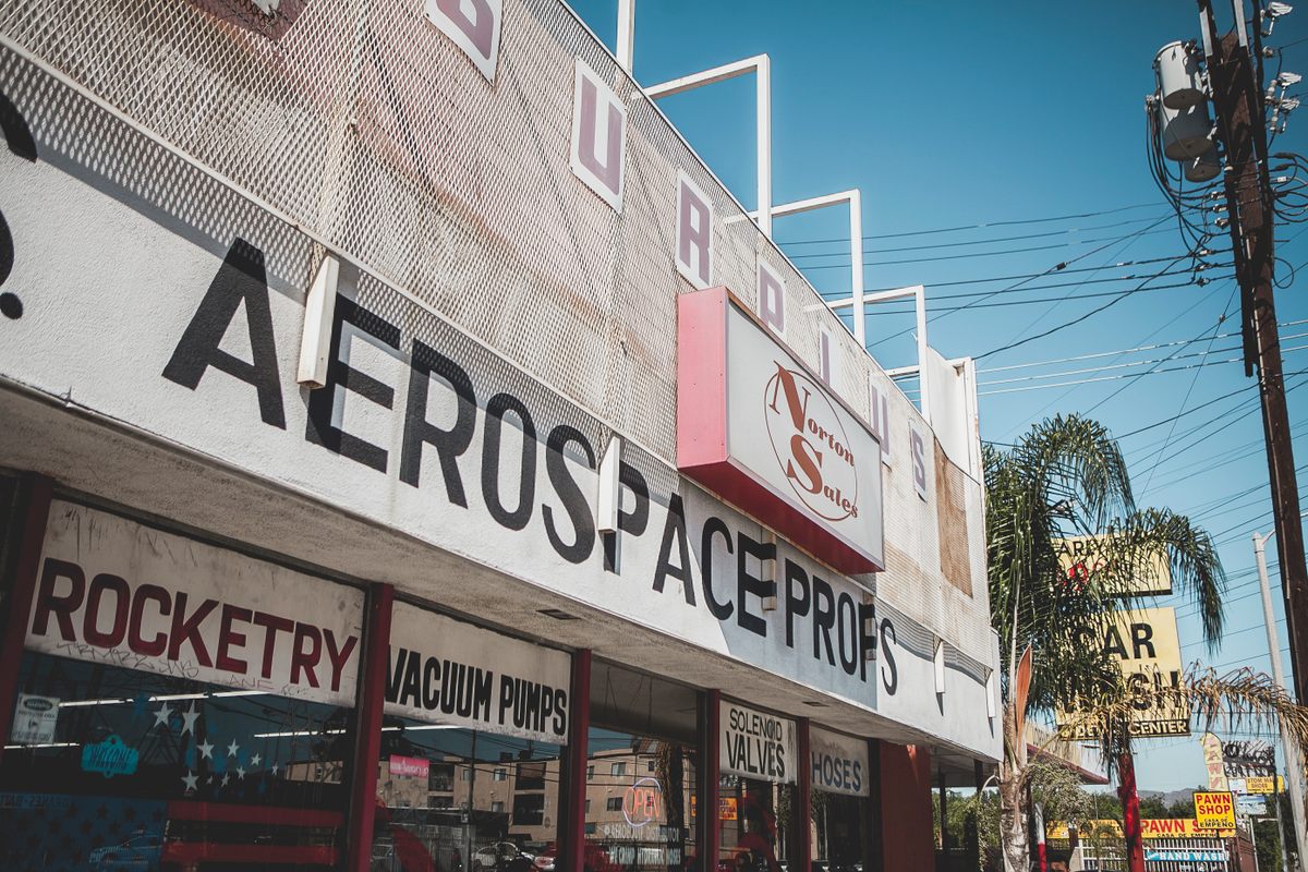
Start the day in North Hollywood at Norton Sales, a spot that’s been supplying rocket scientists, Hollywood set designers, and hardcore car hobbyists with spacecraft supplies since 1962. Opened by a restaurateur who’d begun buying up scrap rocket parts in the late 1950s, Norton Sales’ business boomed as the space race took off and Los Angeles became a hub for space and defense contractors.
Since the 1960s, NASA’s federal spending budget has shrunk substantially and the aerospace industry has largely relocated to the South. Though the shop still receives business from companies such as SpaceX, today it mostly services set designers. Owner Carlos Guzman cites a recent resurgence of space-focused movies (think Hidden Figures, or the Star Wars revival) that have kept the shop abuzz.
For rocket novices, Norton Sales’ cavernous interior filled with mysterious metals can at first seem intimidating. But Guzman (and the shop’s friendly cat, Midge) are eager to welcome visitors and answer questions at length. Don’t miss the engines located at the front of the store: they’re from the original Apollo space program.
MIDCENTURYLA
Just a ten minute drive from Norton Sales, MIDCENTURYLA specializes in another type of 1950s and 1960s ware: furniture. Specifically, the type of furniture that’s dominated design blogs and sophisticated homeowners’ living rooms for the larger part of the last two decades. Though the Midcentury-modern style never truly fell out of fashion in Southern California, owner David Pierce points to Mad Men as an influence on the look’s resurgence.
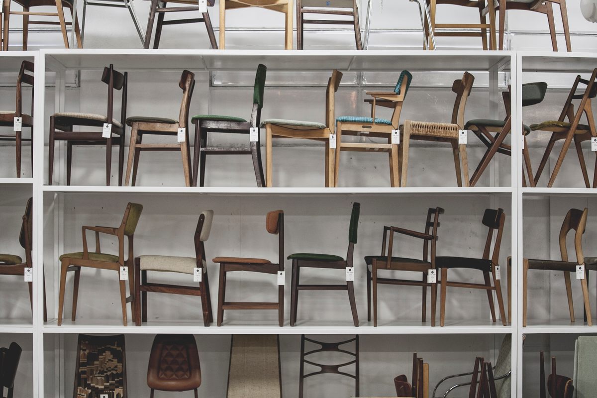
Walking into the warehouse, one is immediately floored by a ceiling-high wall of wooden chairs. Given the prices that teak chairs of this sort can fetch, it’s shocking to see them in such volume and to be reminded of how common the coveted pieces once were.
Pieces at MIDCENTURYLA offer a complex picture of Los Angeles’ relationship with Midcentury-modernism. Though the couches, desks, lamps, and chairs for sale at MIDCENTURYLA epitomize the environs that we associate with Los Angeles homes in the 1950s and 1960s, most of the store’s pieces are imported from Europe.
Manaugh cites the relocation of many European architects to Los Angeles in the years leading up to and following World War II as having precipitated the city’s modernist craze. As Midcentury design has once again become “modern,” it appears its European influence hasn’t waned.

Viviane
Let the midcentury dream linger for a bit longer down in Beverly Hills at Viviane, a restaurant and bar located within the Avalon Hotel. The historic, boutique hotel once hosted Hollywood royalty such as Lucille Ball and Desi Arnaz. Marilyn Monroe called it home for three years.
Redesigned in 2015, Viviane’s lush pastels, clean geometry, and open spaces offer a retro-idealized version of the past (the Los Angeles Times once described the restaurant’s decor as “a New Yorker’s dream of Beverly Hills”).
Serving upscale American fare and 1950s-inspired cocktails, Viviane is the perfect throwback to the sort of poolside-lounging, midday cocktail-imbibing lifestyle that’s long since gone by the wayside for most Americans.

Union 76 Station
End the day with a short walk to the Union 76 gas station at the corner of North Crescent Drive and Santa Monica Boulevard. The station is a perfect example of Googie architecture, a design movement spawned by the explosion of car culture in the 1950s and the need for roadside businesses to capture drivers’ attentions. Built by Gin Wong (an architect associated with the same team responsible for LAX’s Theme Building), the design was originally slated for a location closer to the airport to act as a sort of visual addendum.
According to a report compiled by the Beverly Hills City Council, sales increased from 100,000 to 150,000 gallons of gas per month when the Googie gas station replaced an earlier, more conventional structure. In the case of the Union 76 gas station, Googie architecture achieved its purpose.
Day 3 Agenda:
-
See contemporary art and the latest exhibit at LACMA
-
Grab a bite at Norm’s Diner
-
Stop by the Cardiff oil site
-
Visit LAX’s iconic Theme Building

LACMA
Begin your final day at the Los Angeles County Museum of Art (LACMA), a William Pereira-designed Modernist marvel that dates back to 1965. The museum’s complex of buildings is a superb place to view works of art created contemporaneously with 20th-century design movements. And for the retro-futurist, LACMA’s latest collaboration with Pacific Standard Time is worth a visit.
A Getty-funded project dedicated to exploring Latino art in Los Angeles, Pacific Standard Time’s recent work with LACMA has presented a complex, thought-provoking, and often surprising perspective of Los Angeles’ interlacing history with Mexico. Found in Translation: Design in California and Mexico, 1915-1985 is no exception.
Portioned into four sections, the exhibit features artifacts related to retro-futurist works such as the Hollyhock House and Ennis Houses—forward-thinking structures designed by Frank Lloyd Wright and deeply indebted to ancient Mayan architecture.
In another section, dual pieces explore Mexico and Los Angeles’ simultaneous auto booms. A study for a massive roadside mural at the National Autonomous University of Mexico hangs alongside a sketch for Googie’s, the eponymous coffee shop of the movement.
Norm’s Diner
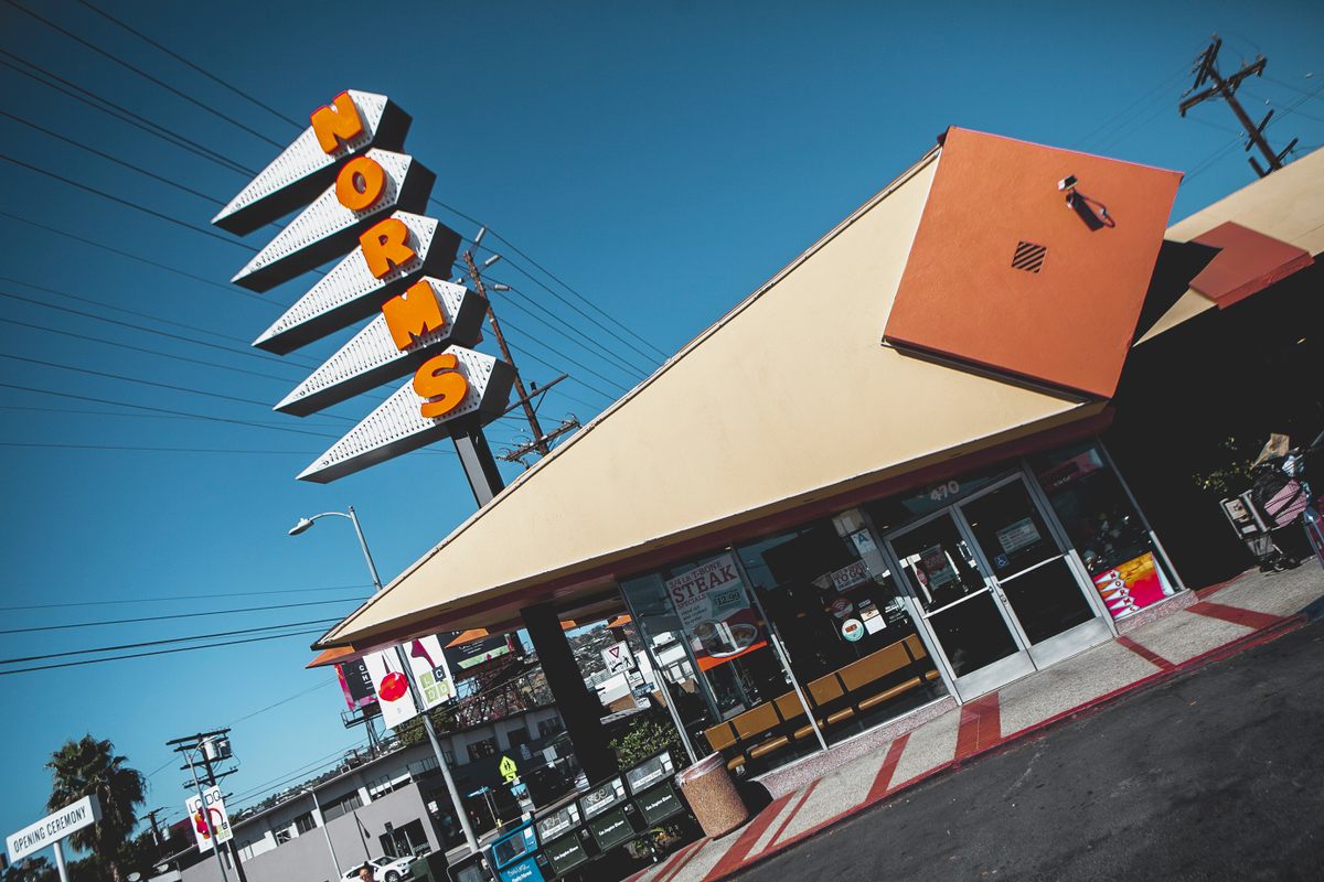
Norm’s Diner is one of only about eight Googie restaurants still standing in Los Angeles. Designed by the architects Louis Armet and Eldon Davis in 1957, the diner’s design typifies the “Coffee Shop Modern” style that the firm helped launch into ubiquity in the 1950s.
As delightful as the diner’s fang-like, tangerine signage is, it serves more than a decorative purpose. Referring to his firm’s Googie output, Davis is alleged to have said: “We would have liked to have made them more aesthetic, but we were just designing them to sell hamburgers.”
Humble intentions aside, the restaurant is a homespun icon for Angelenos. Pop artist Ed Ruscha was one such admirer. In 1960, he helped cement the restaurant’s iconic status by painting it ablaze in a series that depicted Los Angeles landmarks on fire. Designed to sell burgers, the restaurant’s inventive design nevertheless landed it on museum walls.

Cardiff Oil Site
Heading farther south, the synagogue at the corner of Pico and Robertson boulevards doesn’t appear out of the ordinary given its location at the center of an Orthodox Jewish neighborhood. But looking closer, questions arise: where are the windows? What’s the use of a loading dock? Onlookers arriving at the right time may even catch a glimpse of a startling sight: the tower moving.
The “synagogue” is actually a disguised oil well site, formed as such so as not to alarm neighbors in the quiet enclave. Built by Occidental Petroleum in 1966, the Cardiff oil site was hailed as the first “architecturally designed oil derrick,” and the ribbon-cutting ceremony was attended by the mayor of Los Angeles himself.
Despite the accolades, few developers saw it as worthwhile to continue the trend of cloaking unsightly oil derricks. The Cardiff well site is a pleasant monument to a moment of truce between corporate interests and a self-sufficient community.

The Theme Building
A team of architects led by the firm Pereira & Luckman intended to build a massive glass dome that would connect the airport’s terminals and serve as the hub’s main thoroughfare. While plans for that structure were ultimately scaled back, the Theme Building was built on the proposed location of the dome as a memorial to the architects’ ambitions. Manaugh cites the Theme Building as a poignant example of retro-futurism because of its space age-influenced engineering.
The Theme Building’s circular interior hosted a restaurant that originally spun 360 degrees, offering visitors a panoramic view of Los Angeles. It closed in 2013, but visitors who plan ahead can access the observation deck on the second weekend of each month.
Even if the observation deck is closed, it’s worth a moment before check-in to bid adieu to Los Angeles’ retro-futurist wonders by taking in the sight of one of its most illustrious examples.
This post is published in partnership with Discover LA. Click here to discover your LA adventure.



Follow us on Twitter to get the latest on the world's hidden wonders.
Like us on Facebook to get the latest on the world's hidden wonders.
Follow us on Twitter Like us on Facebook