The Hidden Messages of Colonial Handwriting
Back then, penmanship was basically secret code.
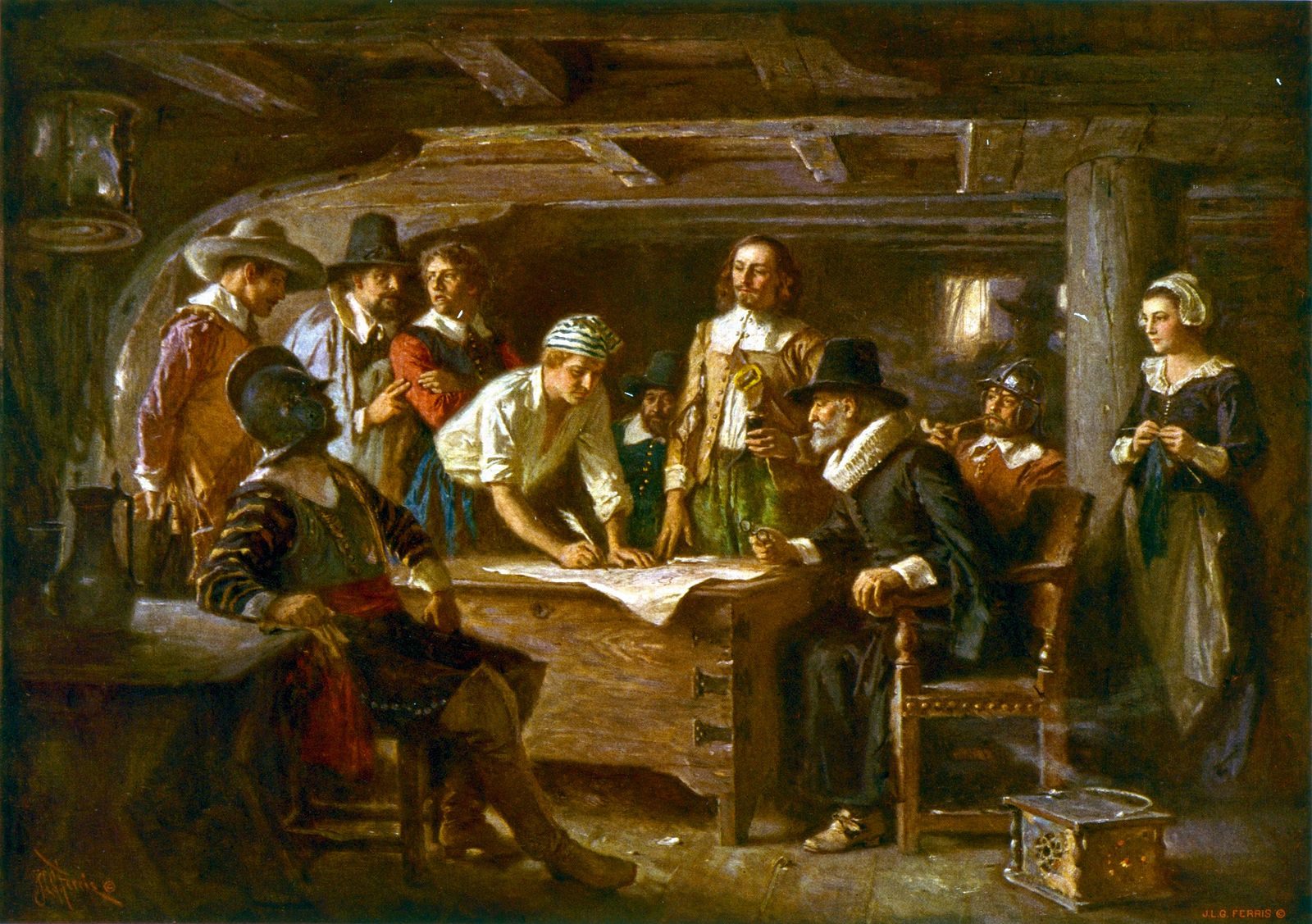
Jean Leon Gerome Ferris’s rendering of the signing of the Mayflower Compact. Each person to hold this quill would have done so in a way suited to their gender, occupation, and maybe even their hometown. (Image: Library of Congress/LC-USZC4-7155)
Imagine a world in which the font you use is chosen for you, based entirely on your demographic affiliations. All doctors write in Garamond, while designers are mandated Futura Bold. Middle-aged men get Arial; women, Helvetica. Goofy aunts must use Comic Sans.
Seem strange? A few centuries ago, that was just how things worked. In colonial America, ”the very style in which one formed letters was determined by one’s place in society,” writes historian Tamara Thornton in Handwriting in America: A Cultural History. Thanks to the rigorous teachings of professionals called “penmen,” merchants wrote strong, loopy logbooks, women’s words were intricate and shaded, and upper-class men did whatever they felt like. So different were the results, says Thornton, that “a fully literate stranger could evaluate the social significance of a letter… simply by noting what hand it had been written in.”
Understanding how colonists put pen to paper means understanding why they wanted to write in the first place. As E. Jennifer Monaghan explains in “Literacy Instruction and Gender in Colonial New England”, Puritans and other early colonists considered reading and writing to be largely separate endeavors. For your average Thaddeus, Miles or Hiram, reading was generally valued not as a skill in itself, but as a direct route to the era’s most popular book: the Bible. Starting around age six, children were taught reading by their mothers, aunts, or grandmothers, with the aid of what John Locke called the “ordinary road” of educational materials—religious texts of varying difficulty, starting with a one-page “Horn Book” and ending with a complete Bible.
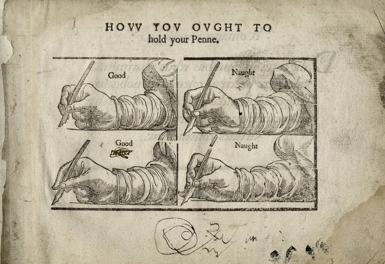
A page from the 1602 copybook, A Work Containing Divers Sorts of Hands. (Image: Folger Shakespeare Library/CC BY-SA 4.0)
Even if you could motor through the whole Bible, though, there was no guarantee you could copy any of it. If “reading was taught first, as a universal spiritual need,” Thornton writes, “writing was taught second, and then only to some.” The practice of writing in the 16th, 17th and 18th centuries was considered less of a creative or analytical endeavor than a kind of rote physical one.
“Just as ‘good’ reading was considered to be accurate oral reading, so ‘good’ writing seemed to be viewed entirely in terms of fine letter formation,” writes Monaghan. Any art involved was concentrated not in what the words said, but in what they looked like.
Because of this, writing was considered a kind of craft—a skill one needed in order to properly carry out his or her other professional and social duties. As these duties differed, so did the type of writing required: loopy or straight, thin or bold, embellished or simple. These different styles were called “hands.”
As with reading’s trajectory, the existence of different hands can be traced back to the relationship between words and religion. In the Middle Ages, church authorities mandated a particular type of dense, blocky script—now known as “Gothic” script—for religious documents. To differentiate themselves, legal and court scribes developed their own, slightly different hands, and readers became accustomed to the symbolic coexistence of different styles. As literacy increased, and more people began writing, a new, thin, flowing style—called the Italian or italic hand—came into vogue, imported from Florence. This new style was meant to be “both pleasing to the eye and easy to read,” writes Laetitia Yeandle in “The Evolution of Handwriting in English-Speaking Colonies in America.”
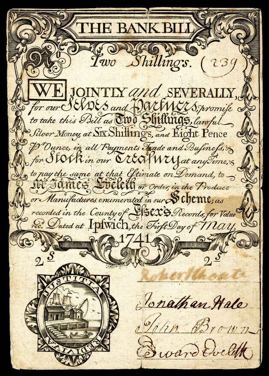
Colonial currency, featuring a mix of old and new-style hands. (Image: National Numismatic Collection at the Smithsonian Institution/Public Domain)
For a brief period in the 17th century, the two hands flourished in America—people sometimes switched between both in a single sentence—but soon, the hierarchy shook out: by the end of the 1600s, the Gothic hand was old-fashioned; the newer Italian hand trendy and on the rise. Though Gothic script was still required for legal documents, everyone else kept away from it—indeed, Thornton writes, its increasing impenetrability may have added to people’s distrust of lawyers.
Those who did want to be trusted made sure to learn the hand that was right for them. To do so, they often employed a penman—an expert quill-wielder who had mastered what was then, as Monaghan puts it, “a fairly arcane skill.” Many penmen were former scribes or secretaries, who had been routed from their old jobs by the development and proliferation of the printing press. All were trained in multiple scripts—“all the most modish as well as necessary Hands,” as one advertisement, dug up by Thornton, read.

“Round hand,” as demonstrated by penman George Bickham in his 1740 instruction book, The Universal Penman. (Image: George Bickham/Public Domain)
A client could hire a penman to teach him whichever script he needed. A merchant, banker or tradesman might learn “round text,” a skinny hand with a slight lean, or “round hand,” a loopier variant—both forms of stripped-down Italian script, good for people who needed to be both quick and legible. Some who wished to differentiate themselves from more prosaic farmers or artisans might learn to add slight embellishments, or ornate capital letters—though penmen cautioned them against compromising their speed or assuredness.
“Among Men of Business, wrote one expert, “all affected Flourishes and quant Devices… are as much avoided as Capering and Cutting in Ordinary Walking.”
While merchants and businessmen worked hard to perfect their round hand, those who leaned on their titles rather than their occupations took the opposite tack. The best way for upper-class colonial men to prove their aristocratic status was to make their work appear effortless. Such people often refused to hire penmen on principal, in order to prove they didn’t need to learn a trade—the on-paper equivalent of growing your nails long, or wearing fancy clothes.
“It is much to be regretted that it has become of late years in a degree fashionable to write a scrawling and almost unintelligible way,” fumed penman John Jenkins in 1813.
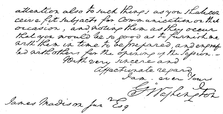
A sample of George Washington’s devil-may-care handwriting. Even decades after his death, Thomas Jefferson praised Washington’s hand, writing to a friend that he ”wrote readily, rather diffusely, in an easy & correct style.” (Image: Moverton/CC BY-SA 3.0)
Indeed, sometimes it seemed like the only ones who cared for what one penman called ”Owls, Apes, Monsters and Spring’d Letters” were the penmen themselves. Constantly striving to be considered artists rather than mere craftsmen, they used what platforms they had to emphasize handwriting’s beauty and importance.
Though their advertisements used practical promises to draw in specific audiences, the copybooks they used to teach their lessons often betrayed their inner romanticism. A seaside penman, fishing for customers in Boston, offered to teach “Gauging, Navigation, and Astronomy” alongside writing, while a Southern one promised two-in-one writing and dance lessons.
Handwriting was not only “useful in Business,” wrote George Bickham in his 1740 work The Universal Penman—done well, it could be imbued with “Masterly Beauty.” Clients, though, preferred to focus on the useful aspects—as Thomas Tompkins, a penman who spent his whole life angling for an invitation to a particular artist’s academy, found out the hard way. After years of talking up his medium, a friend later related, “the luckless calligrapher went down to his grave—without dining at the Academy.”
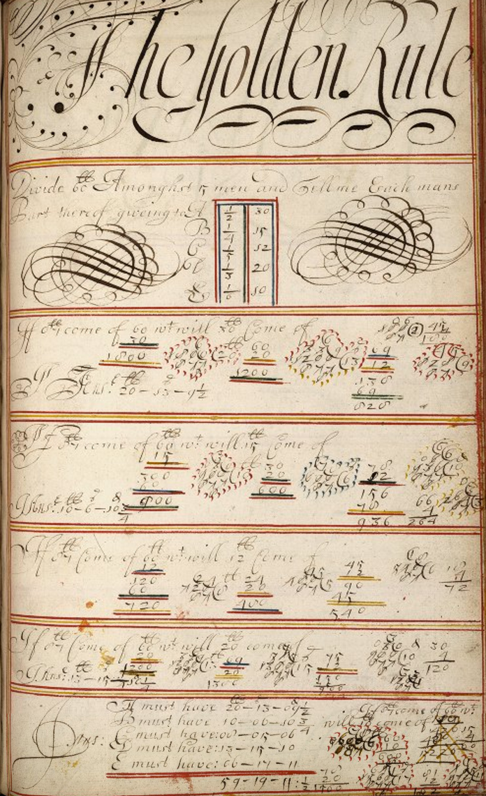
The 17th-century copybook of Sarah Cole, featuring simple arithmetic and complicated doodles. (Image: Folger Shakespeare Library/CC BY-SA 4.0)
Penmen got to cut a little looser while teaching ladies. While working women also learned the round hand, aristocratic women—who, as penman John Davies once wrote, could never ”bruise a letter as men could do”—were privy to a whole different set of scripts. One favorite was the “roman,” a flowing hand which, with its light touch and varying thicknesses, was easy on the eyes and the wrist (as a bonus, it supposedly could not be managed well by men’s fingers, which were “hardened by the sword-hilt”). Certain forms of it even required decorative shading, indicating that the writer had time enough to go back over all her letters—an unmistakeable sign of a leisurely lifestyle.
As Thornton points out, the fact that these hands revealed what their writers did as a profession—or lack of one—kept people in their place. The same thing that enabled people to play letter detective doubled as a subtle form of social control, “guaranteeing that the writing produced by different categories of writers would be accorded culturally appropriate, socially innocuous degrees of authority,” she writes, ensuring that just because literacy was spreading didn’t mean everyone was on an equal footing.
Over the centuries, as notions of identity shifted, handwriting became less a measure of your various statuses than of your individual personality. These days, with the anonymizing veneers of computer fonts, 21st-century humans count on other aspects of self-presentation to give them away—aspects contained in the words themselves, and not their forms. Unless, that is, you send emails in Comic Sans.


Follow us on Twitter to get the latest on the world's hidden wonders.
Like us on Facebook to get the latest on the world's hidden wonders.
Follow us on Twitter Like us on Facebook