We Asked a Vexillologist How to Design a Great National Flag
Behold our new flag!
The United States of America’s flag is iconic, important and more or less timeless. We are extremely proud of its design, and we are very attached to the story of Betsy Ross sewing it.
But let’s take a step back. Is it any good?
Not many people really think about what it takes to design such a standard, and what makes our flag any better than any of the other national standards across the globe. Except for people like David F. Phillips.
“I’m 72. I’ve been studying flags since i was about six years old,” says Phillips, a professional vexillologist, or someone who specializes in studying the design, meaning, and effectiveness of flags. “The thing that most interested me as a child, and what I think still interests me, is the way that flags and heraldry, communicate complicated ideas through the use of color and line, without any words. That appeals to me.”
Among vexillologists, there are a few cardinal rules about flag design that make some flags clear winners, and leave others twisting in the wind. Phillips pointed us toward a short booklet, freely available online, that’s helpfully titled, Good Flag, Bad Flag. This short guide to flag design was put together by Ted Kaye, editor of Raven, the North American Vexillological Association’s official journal, and it lists, in no uncertain terms, what it takes to create a successful flag. Kaye’s guide breaks good flag design down into five essential criteria: simplicity, meaningful symbolism, no more than three colors, no lettering or seals, and unique design.

The first, and arguably most important factor is keeping your flag simple. “I feel like a flag, and this is Ted’s argument too, should be able to be drawn with crayons by a child,” says Phillips. “If it’s more complicated than that, it’s too complicated.” A simple design is essential because, as Phillips explained to us, the very purpose of a flag is to be read from a distance, unlike more complicated seals or heraldic coats of arms. Simplicity is also essential so that a flag can be easily remembered and be instantly recognizable.
Then there is the meaning behind the colors and symbols on a flag.“On a good flag, you want the lines and the colors and the charges if any, to have some real significance for the nation or the institution that the flag represents,” says Phillips. Charges are symbols or geometric shapes on flags, that are separate graphic elements from the larger design, and can often hold a lot of meaning in just a single shape. Take, for instance, the Canadian maple leaf, or the Japanese sun. “You can picture it absolutely because it’s very clear, it’s unique, and also the sun has a cultural significance to the Japanese,” says Phillips. The color can be a shorthand, too, as in the case of Ukraine’s blue and yellow flag, which represents a blue sky over wheat fields.
But the color palette should still be limited and coherent. According to Kaye’s guide, a good flag should contain no more than three primary colors. Kaye lists the basic flag colors as red, blue, green, black, yellow, and white (“White and yellow are called “metals,” after gold and silver,” says Phillips), and most good flags use some mix of these. But it also matters which colors you choose, and for the sake of a flag’s visibility, the name of the game is contrast. “In heraldry, there’s a informal rule that don’t put yellow on white, or white on yellow. And you don’t put red on blue, or blue on green,” says Phillips. “Blue on white, red on gold, that’s a lot easier.” This contrast also ensures that if the flag is reproduced in black and white, it doesn’t entirely lose it’s meaning.
The fourth rule to remember is that words and lettering have no place on a successful flag. The reasoning behind this, as pointed out in Good Flag, Bad Flag, is pretty simple. Words and detailed seals almost instantly blur and lose meaning at a distance.
Lastly, make sure your flag is unique. It’s fine and even somewhat encouraged, to allude to other flag designs, but in the end, it is most important that your flag cannot be easily confused for other flags. “If you look at some of the flags, for the African states for example, a lot of them use red, green, and gold,” says Phillips. “They use them vertically, they use them horizontally, they use them in different orders, some of them use them diagonally. Which one is that? You’re not sure.”
While vexillologists probably disagree as to the specifics, there are flags from nations across the globe that qualify as both bad and good. Phillips’ tastes tend to run towards simpler designs, but even he has his favorites. “My very favorite in the world is the Belgian flag,” he says. “It’s a vertical tri-color, black, gold, and red. These are based on the heraldic colors of the coat of arms of the principal province of Brabant. It’s modeled on the French flag, but it’s so vivid and so striking, and the yellow does that to a large extent. Yellow adds enormous power to any flag. It’s just so beautiful to look at and so distinctive.” In addition to the Belgian flag, Phillips identified other simplistic flags that he finds particularly great like those from Denmark, France, Switzerland, Canada, and Japan.
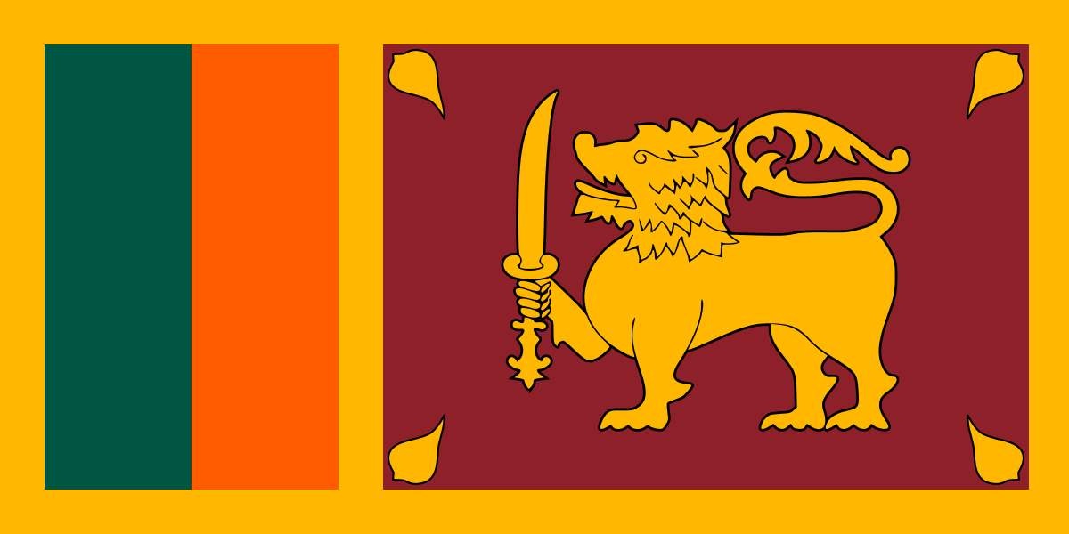
There were even some more complicated flags like the United Kingdom’s Union Jack or Sri Lanka’s national flag, that he called out as being particularly successful. “It is a little bit complicated, although certainly every element has a meaning,” he says of the Sri Lankan flag. “The two stripes near the hoist represent ethnic minorities, and the lion is the lion which used to represent the old kingdom of Kandy, which was a kingdom in the center of what later became Sri Lanka. It has a definite relevance, but it’s also unique in the world.”
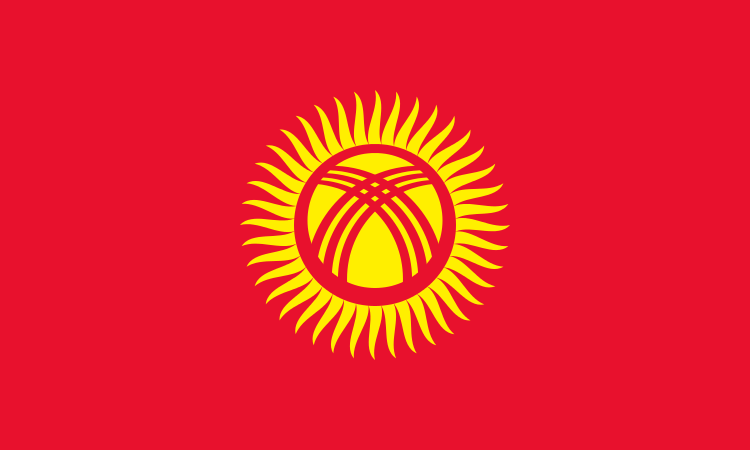
Then there are those flags that just don’t hit the mark. Whether the design is too basic, or not original enough, or just confusing, some flags just don’t work. Phillips brought up the flag of Kyrgyzstan as a good example of a bad flag. “It has a rather distinctive element in the center, which is the chimney of a yurt,” says Phillips. “But unless you’ve been in a Kyrgyz yurt, you don’t really know exactly what you’re looking at. It looks kind of like a gold blob on red. Then the red field suggests a Communist orientation, which the Kyrgyz don’t have anymore. That’s not such a great idea either.” Phillips also called out the flags of nations like Egypt, Iraq, Syria, Yemen, and the United Arab Emirates, for being too similar to be distinctive.
Taking into consideration all of the hallmarks of a great flag, we finally asked Phillips what the national flag of Atlas Obscura might look like. “Atlas Obscura, I’m imagining in my mind, a book, partly obscured,” he says. So, knowing very little about our website, and based on the name alone, he suggested a diagonally bisected field of black and gold, with a book in the middle, which would be half hidden beneath the black half of the flag. “I’m not saying it’s the only solution, it’s just the first thing that occurs to me in five seconds.”
We took his advice, and without further ado, we present the official flag of the nation of Atlas Obscura:

Truly, that is a great flag. If you disagree, feel free to go design your own. At least now you know how.



Follow us on Twitter to get the latest on the world's hidden wonders.
Like us on Facebook to get the latest on the world's hidden wonders.
Follow us on Twitter Like us on Facebook