Why Only Apple Users Can Trash Their Files
A 1994 lawsuit scared other developers away from the garbage can.

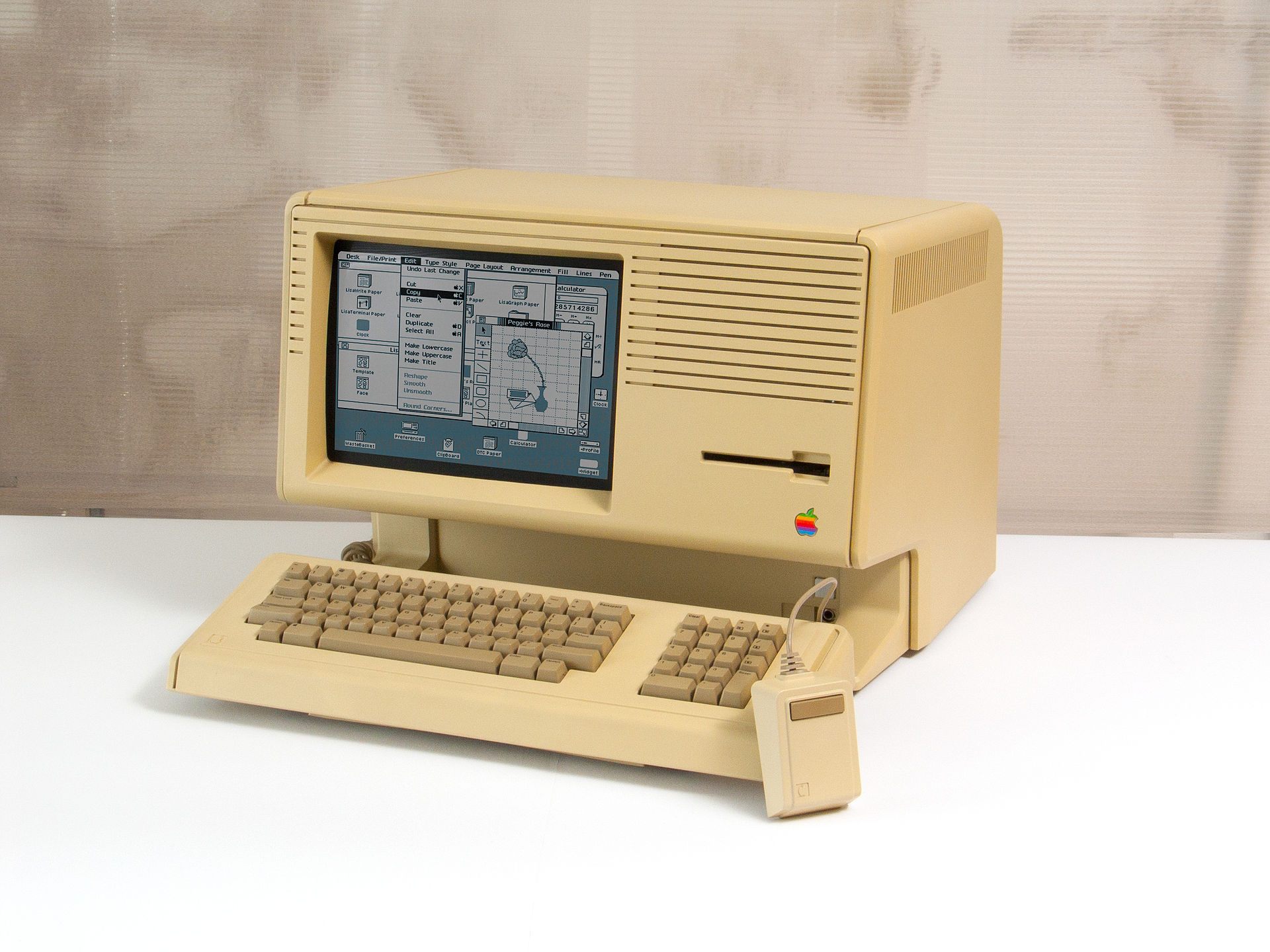
A Macintosh XL running the Lisa operating system. The jaunty-lidded trashcan is visible at the bottom left of the desktop. (Photo: Gerhard/CC0)

No individual part of computing delivers the satisfaction of the trash can.
Drag in your junk, command-click, and with an amiable rustle, all those files you don’t need anymore just disappear. No need to lug anything to the curb, or wait for the city to come around.
But the trash isn’t just a useful tool. A garbage-eye-view of computing reveals three decade’s worth of compelling history for the humble can—complete with a protracted lawsuit that brought the rivalry between Apple and Microsoft to new, garbage-filled heights. It may be that no icon better embodies the development of modern computing quite like the representation of virtual rubbish.
As Apple developer Andy Hertzfeld relates in an online history of Apple’s first user interface, the trash was born in the early 1980s, during a five-year burst of creativity that also brought us desktop windows, text highlighting, scroll bars, and other bits of computing infrastructure most users now take for granted. When the team realized that users needed a way to delete files permanently, they called this new feature the “Wastebasket.” And when the company switched over to an icon-based Graphical User Interface, or GUI, they drew up an old-school can to represent it. “The initial trashcan was this beat up old trashcan you’d expect to see in an alley, with the lid half open and flies buzzing around it,” said software engineer Dan Smith in an 1986 interview with Semaphore Signal. “We had actually talked about putting in some sound effects.”
This dramatic disposal system displeased “some of the stodgier people on the team,” said Smith, and the Apple Lisa shipped out in 1983 with a less visceral version of the icon, its lid tipped jauntily to the right. Later versions of Lisa software renamed this feature the “Trash.” When Apple’s next project, the Macintosh, took over the market the next year, it featured a closed, corrugated-looking can, designed by iconographer Susan Kare.
This tiny, charming illustration soon came to symbolize everything good about the GUI. “If you can find the trash can, you can run a computer,” promised one early advertisement for the Lisa. It also provided a handy way for early adopters to describe the computing process to those who were scared or skeptical. “Cartoon-like representations, called icons, of computer parts or functions, are displayed on the screen and manipulated with a device called a mouse,” explained technology writer Myron Berger in the New York Times in 1986. “So, for example, to erase a particular program, one can simply ‘drop’ the program’s icon into an illustration of a trash can on the screen.”
Later versions of the Mac operating system added extra features–OS 4’s trash can bulged out when full, and the icon design became progressively more three-dimensional, promising infinite roominess. One optional extension for OS 7 even featured a tiny, pixelated Oscar the Grouch, who popped out of the can singing his signature tune, “I Love Trash.”
Almost immediately, GUIs became the undisputed future of personal computing. Apple’s competitors turned up the gas on their own desktops and icon sets. This race to the top of the PC food chain was dizzy with ripoffs and secret agreements—Apple may have swiped the whole idea from Xerox during a 1979 tour of the company’s research arm, and in 1985, they gave Microsoft under-the-table permission to use many of their designs in exchange for help developing new software. In the rush to stay current, everyone played fast and loose.
Eventually, though, things got too close for Apple’s comfort. In 1988, Apple sued Microsoft and Hewlett-Packard over the “Mac-like”-ness of their newest operating systems, Windows 2.03 and NewWave. The suit named 189 separate parts of Windows and NewWave that, in Apple’s view, aped the Macintosh OS, including click-and-drag, folder icons that dim when in use, and a overall desktop consisting of “overlapping rectangular windows in front of a muted background pattern.” Taken together, Apple argued, these elements made the “look and feel” of a Windows computer far too similar to that of a Mac.
But Apple’s allegations fell too far from the tree. After six years of litigation, the suit found its way to the Ninth Circuit Court of Appeals, where the judges held overwhelmingly for Microsoft. Because no one can copyright a concept, “Apple cannot get patent-like protection for the idea of a graphical user interface, or the idea of a desktop metaphor,” the decision read. Due to their earlier agreement with Microsoft, Apple’s attempts to retain rights to particular icons and design choices also largely failed. Besides, as more and more GUIs entered the public eye, the company’s nitpicky insistence on their ownership of certain graphic elements started looking less like a feasible complaint and more like “a curious sideshow,” the Seattle Times wrote.
The evolution of the Recycle Bin in #Windows
— Microsoft Egypt (@MicrosoftEgypt) October 18, 2015
تطور سلة المهملات في #ويندوز pic.twitter.com/nUGvMd2iDl
Apple did win one small victory, though. Judges ruled that, in one particular iteration of the Windows-HP desktop, the trash can looked a little too much like Apple’s. “Like the garbage icons in the Macintosh and Lisa, the Waste Basket icon in NewWave… is depicted as an outdoor alley-style cylindrical garbage can with a lid and a handle on the top,” the judges wrote. The same was true of NewWave’s folder icons.
Of all the supposed similarities, the trash alone was a bridge too far.
Although this was literally the opposite of what Apple hoped for—“I don’t want to end up with this case saying ‘oh, well, all we have to do is change a trash can,” one of the company’s lawyers said during the trial—since then, Apple’s competitors have shied away from trash cans. The ’90s version of Norton Desktop used a “shredder” and a “Smart Eraser.” X Window System, an open source software most popular with Unix-users, has a “Dumpster.” And regular old Windows, of course, still uses a Recycling Bin–which, if you know its backstory, seems like a cheeky homage to its original source.


Follow us on Twitter to get the latest on the world's hidden wonders.
Like us on Facebook to get the latest on the world's hidden wonders.
Follow us on Twitter Like us on Facebook