Explore Historic Maps of Scotland, Now in 3D
The National Library of Scotland isn’t afraid of heights.
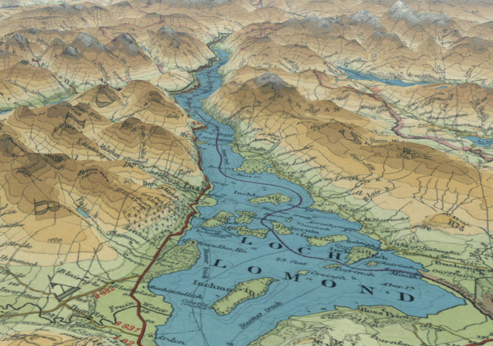
Mapmakers of yore worked hard to remind viewers that a given landscape was much less flat than the paper they were holding. Cartographers employed contours, hachures, and other shading techniques to indicate slopes and varied terrain, and while these abstractions conveyed the general gist, if you had little else to go on, it could still be hard to glean the “reality of the landscape,” writes Chris Fleet, map curator at the National Library of Scotland, in an email. That nuance mattered, though: “The development of canals, roads, and railways, the location and growth of settlements, and patterns of population density, were often all influenced by relief,” Fleet says.
These days, of course, much of the planet has been mapped by satellites, and viewers can parachute in and survey jagged ranges and humped hills the way birds see them. Meanwhile, a number of historic map collections have rolled out tools for engaging with old maps in new ways, through swooping, zooming, and more. The National Library of Scotland is among them, and recently revamped its 3D tool by dialing up the vertical exaggeration.

When the library’s 3D viewer, which uses open-source Cesium ion data, launched in 2016, cartographic explorers could tweak altitude, tilt, and orientation. Verticality was fixed, though, meaning that any landscape you soared above didn’t look as rugged as it does in real life.
Now that the tool has been refined for verticality, draping old maps over elevation data can help viewers picture gradations more easily. “Not just where the real heights of the mountains are, or where the valleys are,” Fleet writes, “but all the more subtle variations in terrain, too.”

Which maps are the best candidates for this treatment? “It needs to be [one] that can be geo-referenced fairly well, so it locates accurately in the right place and combines with the right elevations,” Fleet says. Beyond that, Fleet notes, maps that used various colors to represent relief are often striking. Take, for instance, this one by the Edinburgh outfit John Bartholomew & Son, depicting scores of brown mountains flanking the green-blue Loch Lomond, or the detail above, which focuses on Loch Tay.

Soil maps—like this one, surveyed on the Island of Mull in 1972—are also good contenders, because the hues, which represent different types of soil, tend to correspond to bands of altitude. Rocky crags and summits are blue and purple, while steep swaths of scree are light brown. Lower knolls are lighter greens and browns, Fleet says, freckled with moraine from the last Ice Age. Damp, rain-logged expanses of peat are various shades of purple. While soil doesn’t boil down to elevation alone, Fleet adds—rocks and land use play a role, too—“the significant elements of altitude and slope can be easily brought out by draping the map over 3D elevations.”
For me, at least, playing around with the maps made the past feel vivid and tangible. It was as though I was shadowing a surveyor tromping along a few hundred years ago—and we clambered across the landscape together.
















Follow us on Twitter to get the latest on the world's hidden wonders.
Like us on Facebook to get the latest on the world's hidden wonders.
Follow us on Twitter Like us on Facebook