The Unsung Delight of a Well-Designed Endpaper
They’re an art form all their own.
When you open a book, an endpaper is the first secret hiding in between the covers, and a good one can deliver a jolt of wonder. “One of my favourite ways that designers provide surprise is through creative endpapers,” writes Holly Dunn, a book cover designer, “where the viewer opens the book and finds something entirely unexpected and delightful inside the front page.”
Endpapers are often overlooked—an over-eager reader can breeze by even the most striking—but they’re an art form with a history all their own. For centuries, designers have taken the formal necessity of joining a book’s pages to its cover and turned it into an opportunity for creativity. Not every designer is excited about endpapers, but those who are can use it to elevate the beauty of any book.
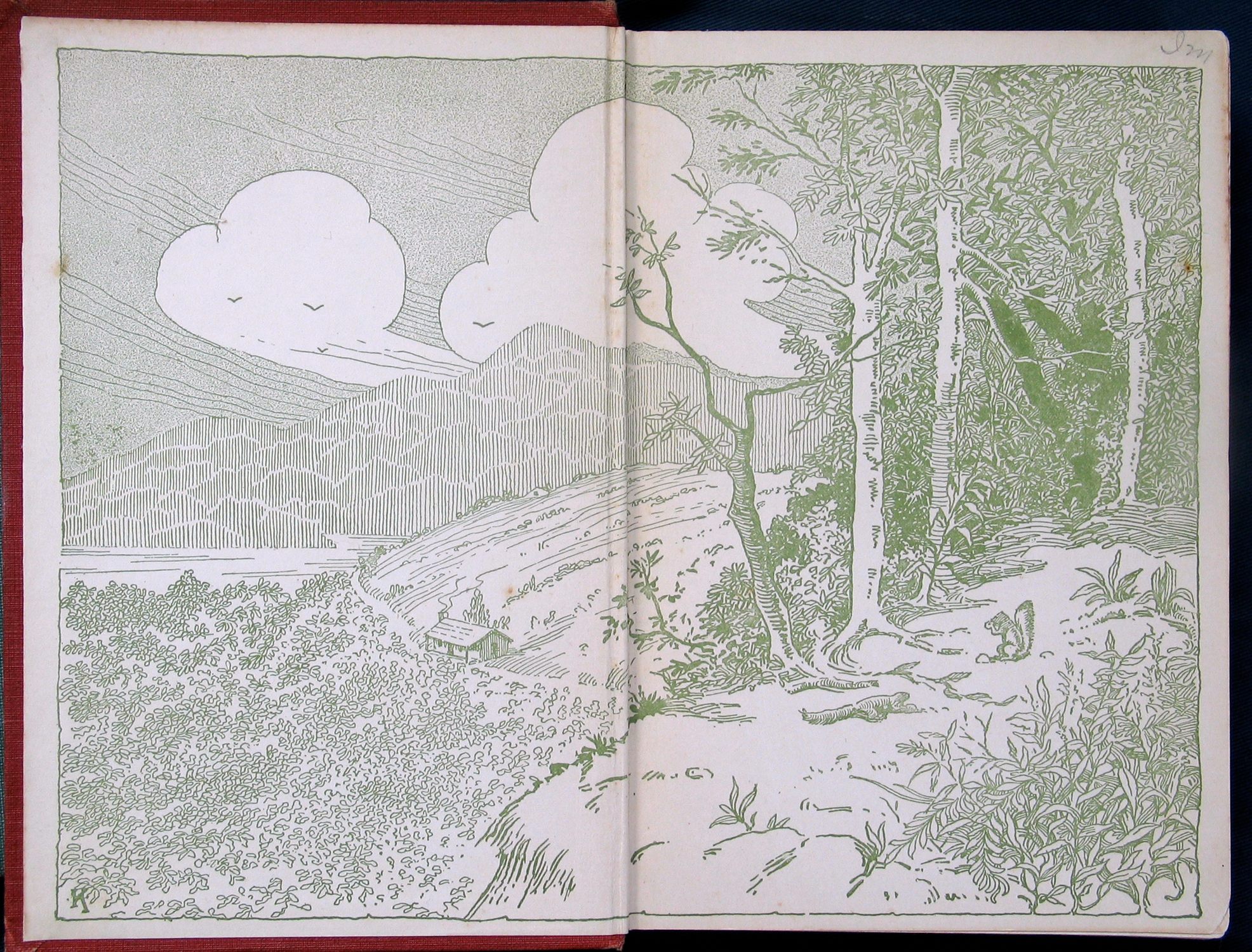
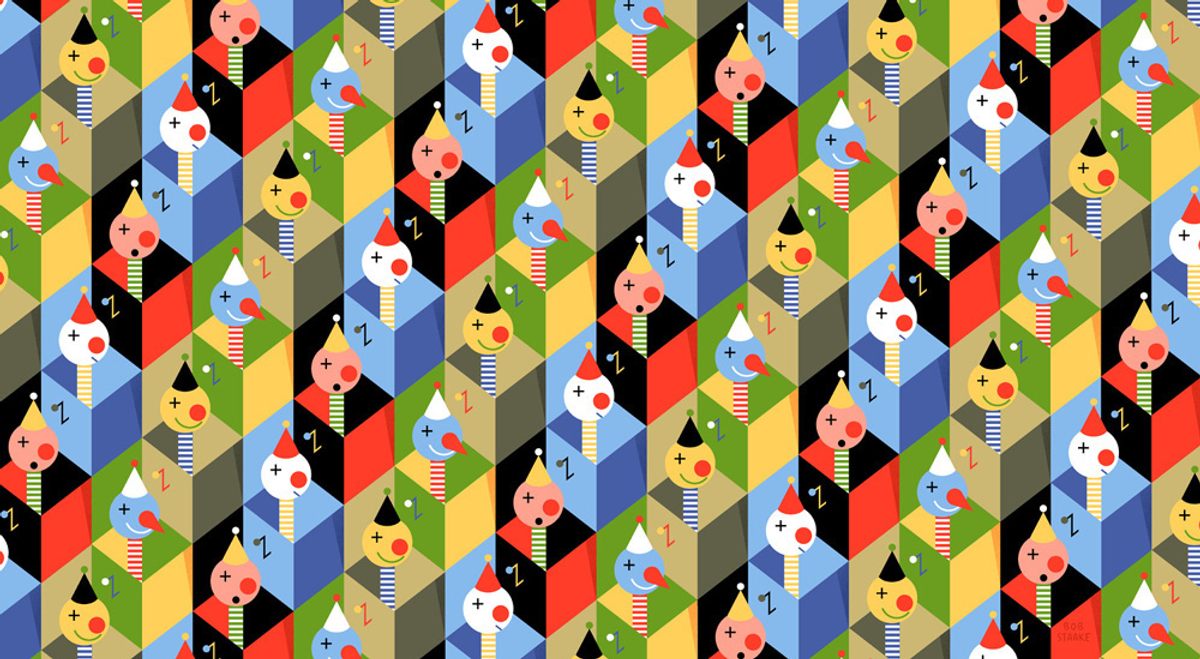
“I’m always surprised at illustrators who don’t take the opportunity to do some lavish endpaper,” says Bob Staake, an illustrator and the creator of The Art of the End, an as-of-yet unpublished book celebrating the teeming variety of endpapers. “When you find an illustrator who’s respectful of the art form and wants to celebrate its tradition, you see it as something that really stands out.”
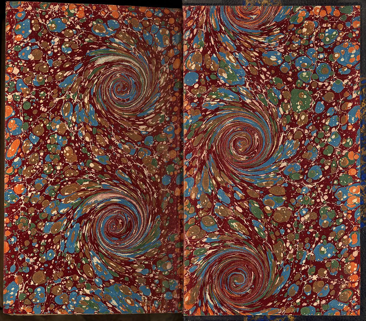
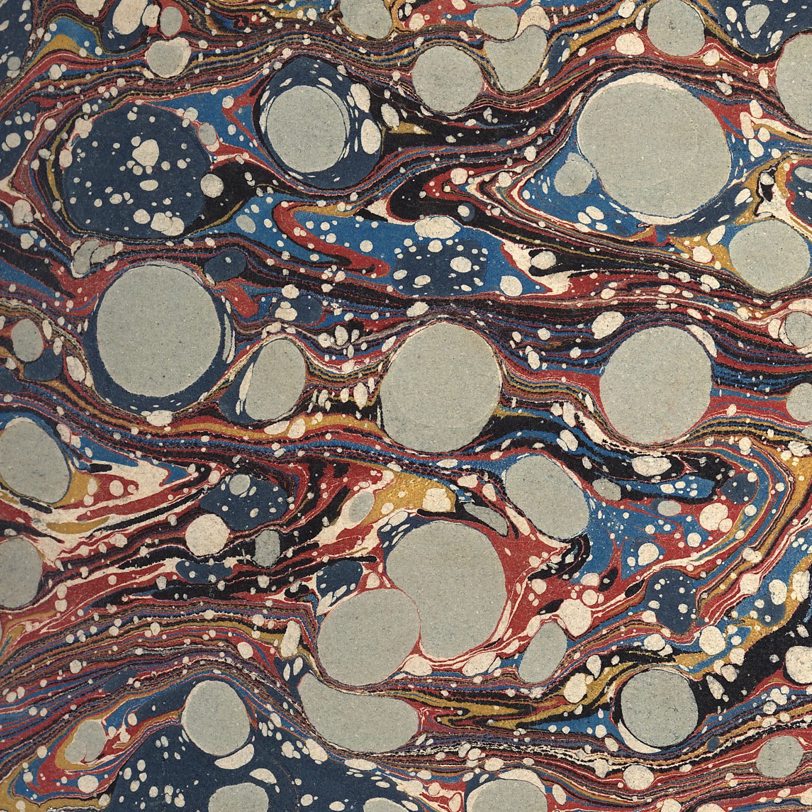
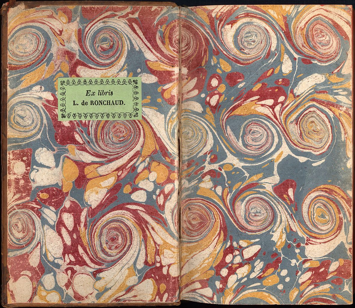
When a book is made, one side of an endpaper (sometimes also called an endpage or endleaf) is pasted into the inside of the book’s cover; the other side is the first page of the book. “Endpapers quite literally hold a book together,” says Staake. Originally, they were made of white paper, sometimes scrap leftover from other uses, or of more sturdy vellum, a thin parchment made of animal skin. But in the 18th century, after techniques of marbling had come to Europe from Turkey and Iran, European bookmakers started decorating them with French curls, Dutch combed patterns, classic Turkish stone motifs, and a swirling varieties of other patterns.
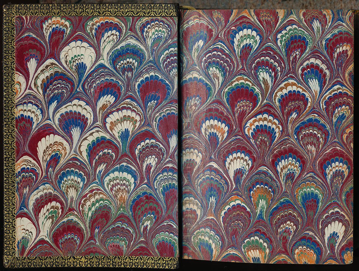
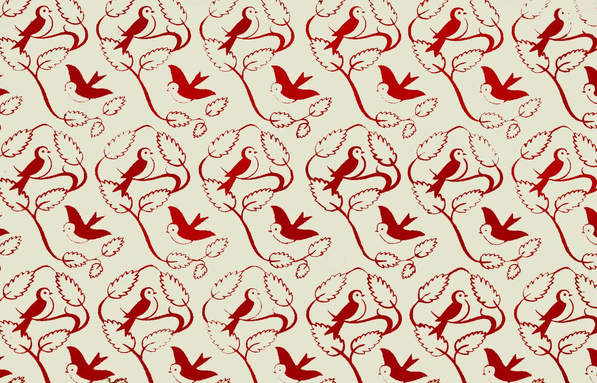
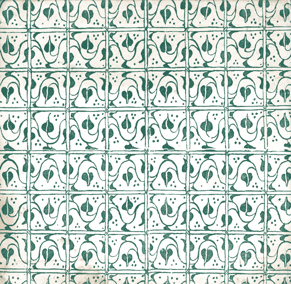
When block printing became possible in the 19th century and bookbinding was mechanized in the 1830s, the style of decorative endpapers changed. Now these pages were covered in wallpaper-like, repetitive patterns, “often made from printers’ ornaments,” according to the Salem Athenaeum. Those images developed into softer, more ornate patterns of flowers, ferns, and other natural themes.
It was only toward the end of the 19th century that endpapers started to be illustrated with images that teased at or complemented a book’s subject. Around the early 20th century, children’s books started carrying illustrated endpapers as well, and today they contain some of the most vivid and creative endpaper examples.
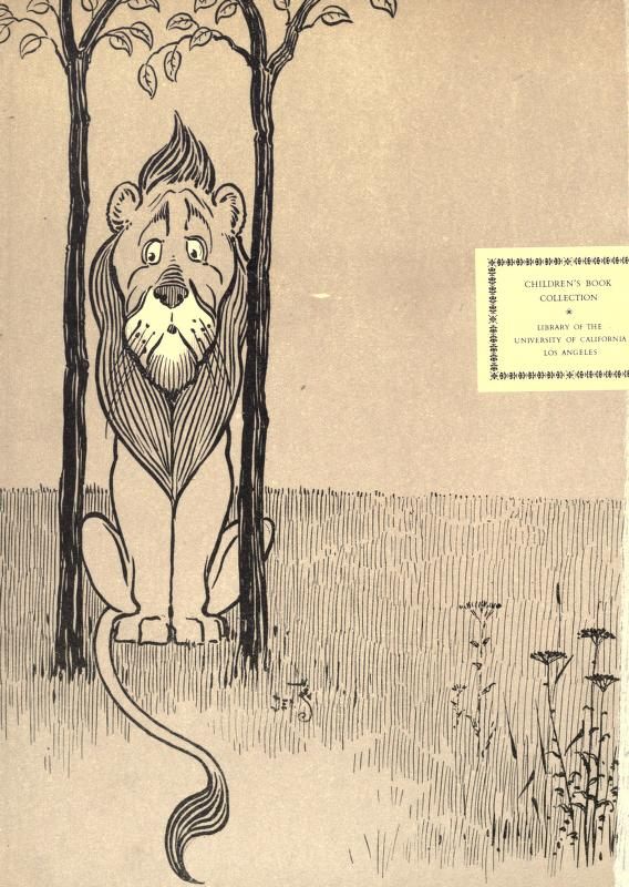
Endpaper space might be used to publish a map of the place where a book takes place, whether real or fictive, or it could be used to illustrate a book’s theme. Tucked inside, endpapers can also be bolder than a book’s outside: “They aren’t thrust into the limelight like the cover and spine, and therefore can push the boundaries more,” writes Dunn. Sometimes limited run editions of a book will have hand-painted endpapers; some rare books are snapped up primarily because of their endpapers.
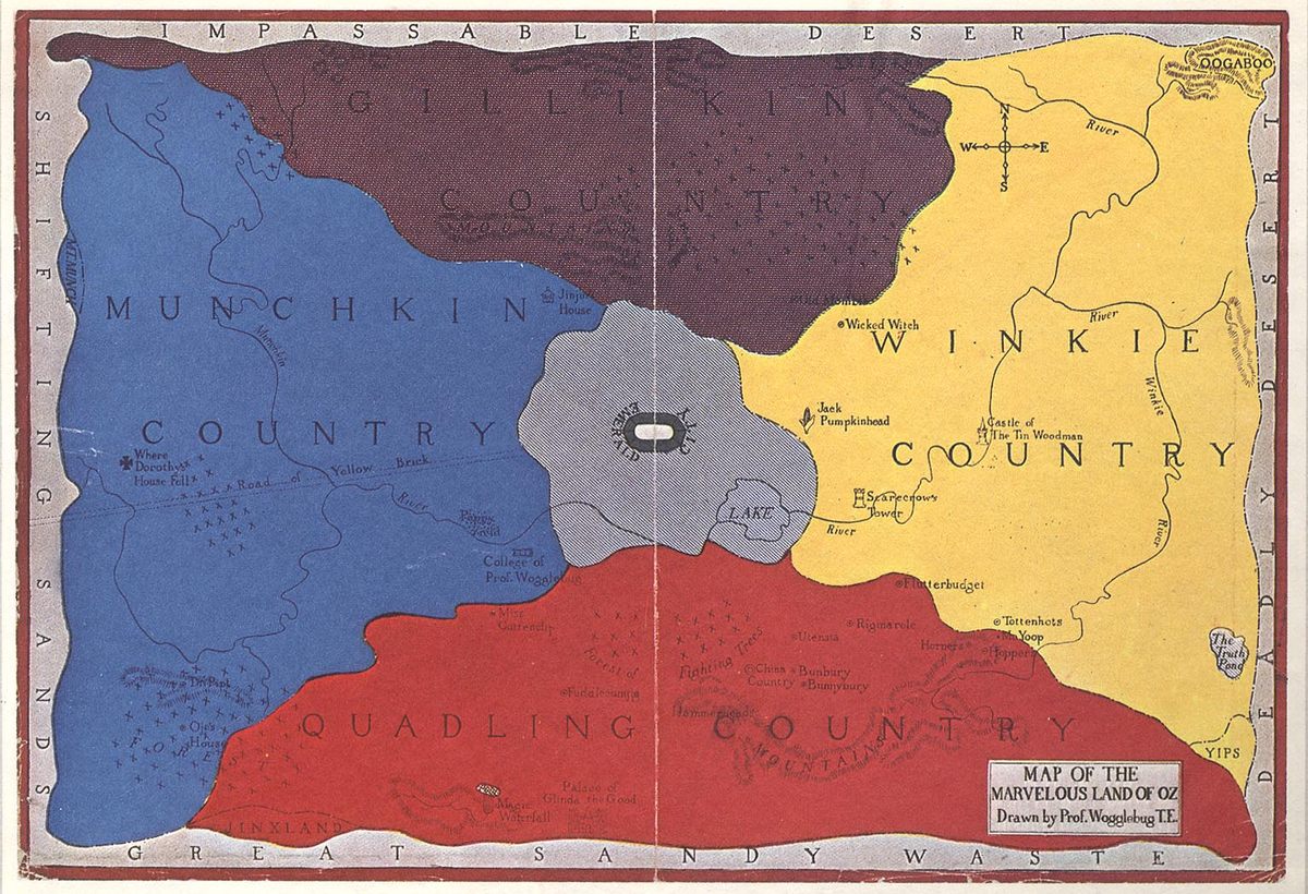

Endpapers can contribute to telling a story even if they’re not illustrated: a red endpaper at the front of a book might communicate the heat of the sun, and a blue endpaper at the back, the cooling rain that ended the drought. And if the endpaper can include an image, the creative possibilities are as varied as books themselves, as this collection shows. Endpapers can be titillating, they can be bright and bold, they can draw you in with a wealth of detail.
When Staake creates endpapers for his own books, he likes to riff on the tradition of repetitive wallpaper patterns, drawing in themes and characters from the books themselves.
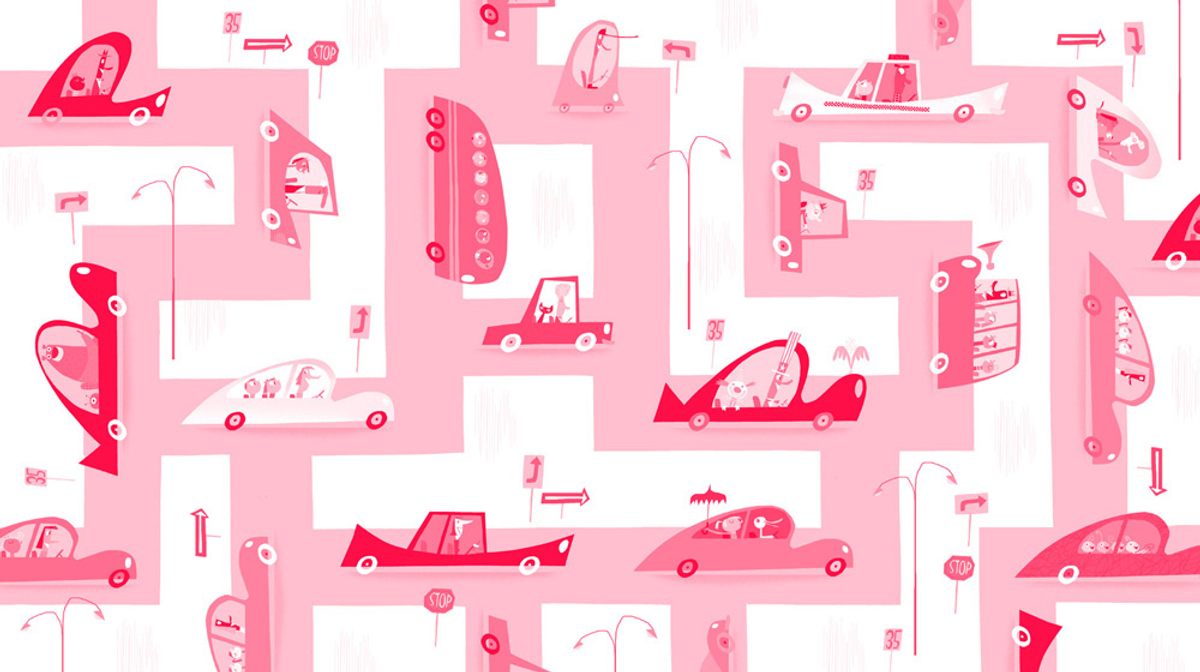
“I’m always thinking at about the halfway point, what are the end papers going to be?” he says. “I think they’re very poetic.”



















Follow us on Twitter to get the latest on the world's hidden wonders.
Like us on Facebook to get the latest on the world's hidden wonders.
Follow us on Twitter Like us on Facebook