How a Cartographer Drew a Massive, Freehand Map of North America
Just ink and colored pencil, it took Anton Thomas almost five years.
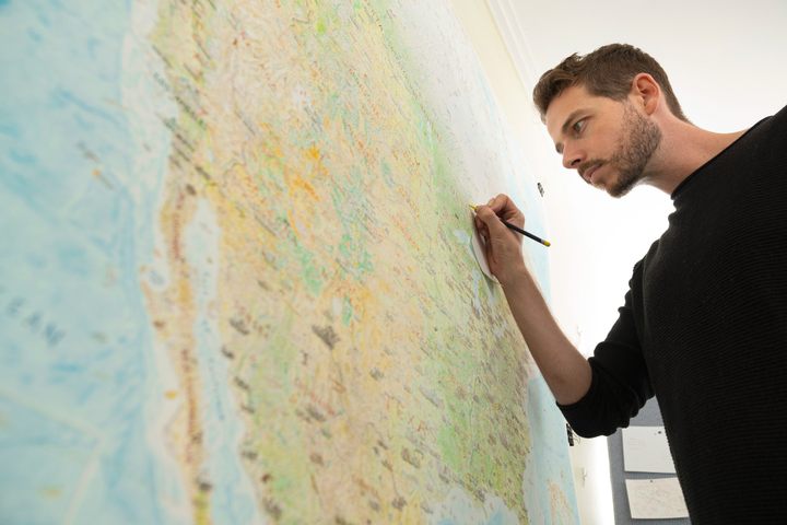
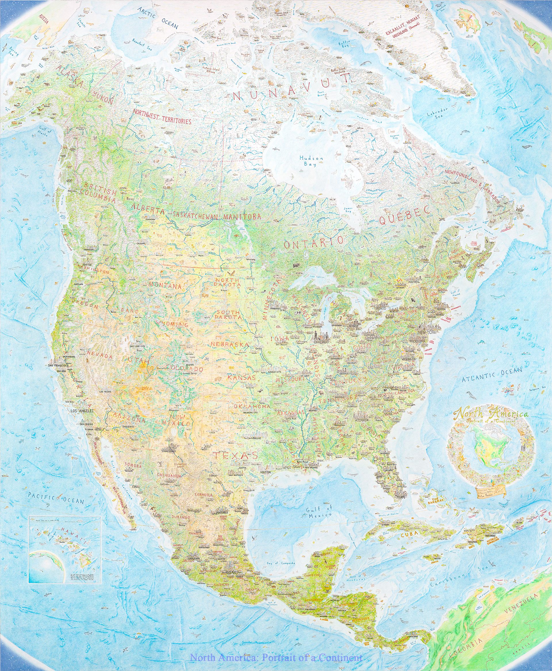
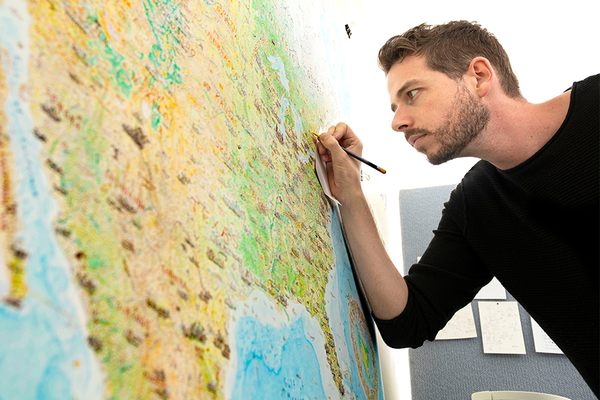
North America has nearly 10 million square miles of prairies, mountain ranges, forests, taigas, and deserts, rimmed by nearly 40,000 miles of convoluted coastline. It’s huge and lively, with more detail than most can imagine, much less commit to paper. But for four years and nine months—averaging more than 5,000 square miles per day—Melbourne-based Anton Thomas drew North America by hand, using a pen and about 24 colored pencils. His final product, completed in February 2019 and spanning 20 square feet, has completely reshaped Thomas’s life.
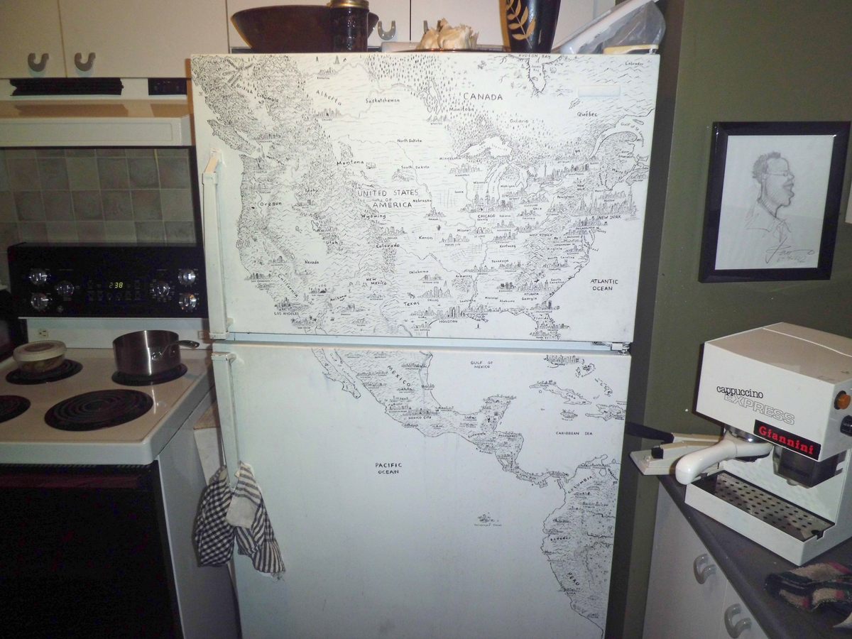
For Thomas, now—for the first time in his life—a freelance cartographer, who tours the world exhibiting the North America map, geography is a bit of a homecoming. He had begun drawing maps for fun as a child, and then took a decade-plus hiatus from it. He began sketching again while living in Montreal in 2012—on his refrigerator. The result was a detailed predecessor to his new map, which is pictorial, illustrated with all sorts of landmarks, fauna, and flights of fancy.
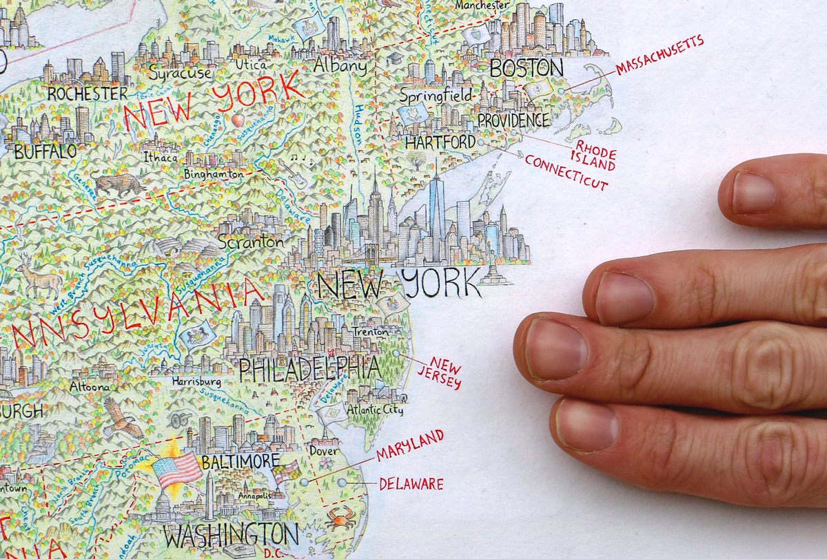
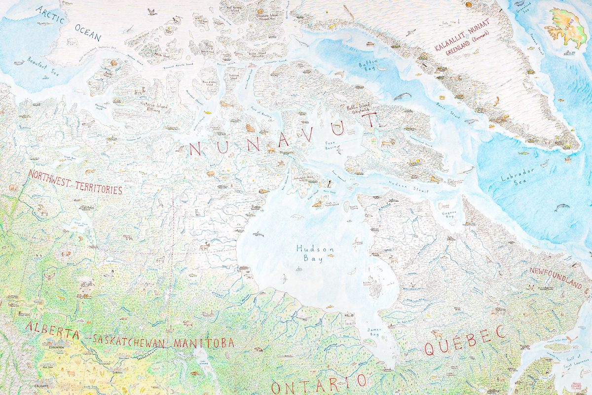
From the Arctic reaches of Nunavut’s Ellesmere Island (featuring a musk ox) to the tropical forests of Mexico’s Yucatán (with a toucan), the map is a stunning reminder of what can be accomplished with a little bit of skill, a lot of imagination, and even more hard work.
Atlas Obscura spoke with Thomas about the latest work, prints of which will be on sale in January 2020.
Let’s start with the fridge. Why did you start drawing a map on your fridge?
I was working as a cook in the old port of Montreal. And in classic Montreal fashion, we had littered the apartment with things we found on the side of the road. And one was this big fridge. It had all these rusty, brown stains on it. My housemate Douglas, from Zimbabwe, had been urging me to draw him something as a memento, since he knew I was going to go back to New Zealand. He had painted the fridge with white house paint to cover up the stains and I thought, “What about the fridge?”
The fridge was in use, so it was full of food and the door would need to be opened. I’d be sitting there, drawing on the fridge—though most of it was really on the freezer, not the fridge. And the sink was next to the fridge, so water would splash on it and I’d have to paint over the streaks and redraw. That wasn’t exactly easy. At all.
I started with British Columbia, and when I got to Vancouver, I thought, “Wow, it would be pretty cool to draw the Vancouver skyline,” not really thinking about the precedent you set by drawing one skyline. And then I got to Seattle, and Portland, and San Francisco, and onward and onward.
How does mapmaking shape your worldview?
There are two aspects to everything I’m doing. It’s half technical execution and half research. It’s not an exact split, it’s intertwined. The reason the map works is because the world is so interesting. I’m just trying to take the real content I find in the world and make it look nice.
Through an Australasia map I drew between the North America maps, especially with Australia and New Zealand, I was having to think about my reality and my own experience in life and where I’m from. Going to North America after drawing my own part of the world, it was less abstract. You need to draw places with respect and patience. You have to always remember that it’s the real world that you’re representing, and that means real people, and places that are a part of who we are.
The map has so much detail, but how did you decide what to include and what to leave off?
Everything south of populated Canada, my metric was at least 100,000 people in a metropolitan statistical area. Everything above that is a whole different game, because you don’t have that many people. The Canadian Arctic, Greenland, and Alaska. The metrics are good for me because they break up certain hubs if there’s enough geographic space between them. The difference is like how Manhattan dominates Jersey City or Yonkers.
I am self-taught. I haven’t had cartography or art training. It’s been a process of just figuring it out as you go, and taking real stock of people’s feedback. That feedback informs your vision, your geographic vision. If a local tells you what you got right or wrong about their state, it tells you a lot more about what you got right or wrong than what you get from Google Street View.
Have you gotten any negative feedback?
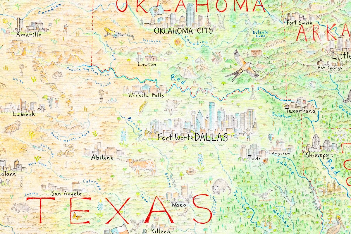
One of the first times I published my map online was the subreddit r/MapPorn. It was a really terrible picture, actually, but it was part of the South and it had Texas in it, and Louisiana and Arksansas. I drew Dallas, but not Dallas–Fort Worth. The metroplex is a twin-city dynamic. The response to that was savage. I remember distinctly being called a fool. And I was like, “Okay, this isn’t your average trolling.”
But you’re just awash in information, so you have to create rules around the map. It’s important to have those guidelines, but you have to have some give in it as well. In the years since I drew the map, I go over it all the time. But at the time—I was in Melbourne drawing this—I was just looking at a list of cities. And it was Dallas: check.
There are so many illustrations beyond geographical places. How did you decide what to put where?
I think the animals help people engage with the map. They’re residents of the land. A longhorn is really going to help you in Texas. A grizzly bear is great in western Montana. But sometimes I’ll just have a bit of space, and put some wildlife there, so I have a skunk in Kansas, which doesn’t really endear me to people in that state. They take it alright, but in the United States, you have to be a little careful.
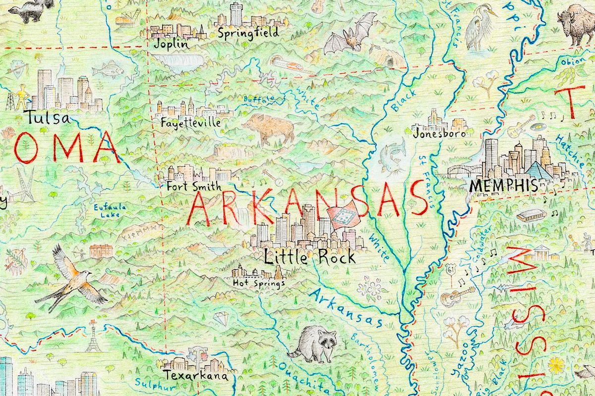
And when I put this raccoon in Arkansas—slightly more popular than a skunk—I got this email from a guy who said, “I was sold the moment I saw that raccoon in Gillett, Arkansas, to commemorate our annual raccoon festival.” But I was like, “What the hell are you talking about?”
But it’s not just the animals or the cities. Content all across the map says things about agriculture, culture, history. I try and be apolitical as possible in the things I represent, but it’s a little hard. Because you’re trying to tell the story of place, and places are complicated. They show up in statues, and landmarks, and the state flags.
I think it helps that I’m a Kiwi, I’m not American, but I have a love for the continent broadly.
What impact did the map have on your life?
From when I made the fridge map in 2012 through the first year of the big one, I was lost. I was truly on the road, Kerouac-style. I was cooking, I had ambition and aspiration, but I wasn’t in a good place in my life.
The ray of sunshine through all of it was these pictorial maps. When I started the North America map I was directionless, and I needed a map.
You must know a lot about North America now. Where do you most want to visit?
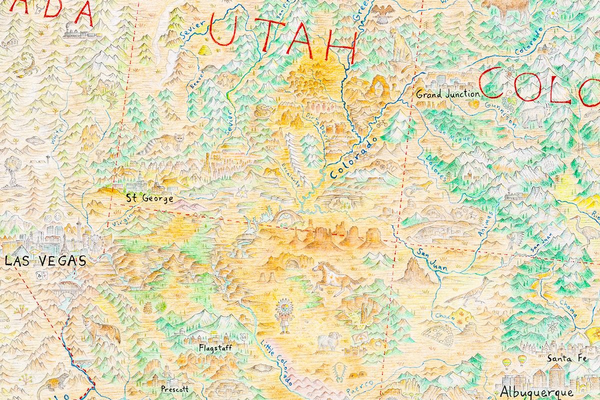
Out of the whole continent, southern Utah. It’s a popular place to go, but I haven’t made it yet. It looks absolutely, out-of-this-world beautiful. There’s Grand Staircase, Arches, Bryce Canyon. When I was drawing it I was like, “Get out of here. This is so damn beautiful.” Coming from the South Island of New Zealand, we have some pretty great scenery. But southern Utah looks supernatural.
Also Baffin Island in Greenland. So few people have been to that part of the world. And Cuba. I want to go to Cuba so badly. I was listening to Cuban music as I drew Cuba. It’s just like when I was drawing the Arctic, I was listening to Inuit throat singing. And I put my air conditioning as cold as I could in my house, just trying to imagine dark winters and snow under my feet. Does this actually impact what I’m doing? Maybe. But now I’m expanding my music taste, and if you’re more engaged with the task at hand, there’ll be no rushing.
This interview has been edited and condensed.






Follow us on Twitter to get the latest on the world's hidden wonders.
Like us on Facebook to get the latest on the world's hidden wonders.
Follow us on Twitter Like us on Facebook