A 19th-Century Cartographer Crammed All of Human History into this Map
It presents important events from the beginning of time as rivers flowing into and out of each other.
Detail from J.H. Colton’s Stream of Time. (All photos courtesy of David Rumsey Map Collection.)
In 1842, mapmaker J.H. Colton tried to chart the history of the universe in just under nine square feet.
His diagram, called Stream of Time, or Chart of Universal History, takes the form of a 45-by-28-inch map with winding rivers and tributaries feeding into one another.
 Colton’s full map from 1842.
Their source, shown at the top, is the heavens, the epicenter of all creation. Well, at least according to Colton.
 The starting year of all of history, according to Colton’s flowchart.
Going by the Stream of Time depiction, history began in the year 4004 BC. His meticulous attention to detail presents us with a beautiful portrait of the goings-on of civilizations, empires and characters that flow throughout time.
Three thick streams on either side of the map take us through what Colton considers history’s most important eras—the destruction of Sodom and Gomorrah, for example—great characters like Charlemagne and Shakespeare, and events and inventions, which range from “Creation of the World” at the beginning of time to “clocks with wheels” around 1100 AD, to name a couple.
The other streams of water, nestled within, represent states that flourish, merge together, or cease to exist altogether. By 1842, the waterway of Prussia has swollen to become larger than most, expanding widely from its inception as a tiny brook around the end of the first millennium. Around the turn of the 19th century, a branch splits off sharply from the river that is Spain, becoming the independent states of South America after a series of revolutions. These countries join the ranks of France, Persia, and China.
 The bottom of the map reflects the Latin American Wars of Independence.
American independence is reduced to a barely legible line in the context of millennia of historical developments incorporating the birth of Jesus Christ, the rise and fall of the Roman Empire—that great behemoth that “swallowed up” most of the streams feeding into it—the union of Castile and Aragon and the French Revolution.
 The massive body of water on Colton’s map that is the Roman Empire.
Some of what are arguably the most important historical developments of Colton’s era—such as the 1814 Congress of Vienna and the Greek War of Independence that began in 1821—make an appearance on the map, and rightfully so. Others, like the classification of William Henry Harrison as the most recent of the “Great Characters” hold less weight today.
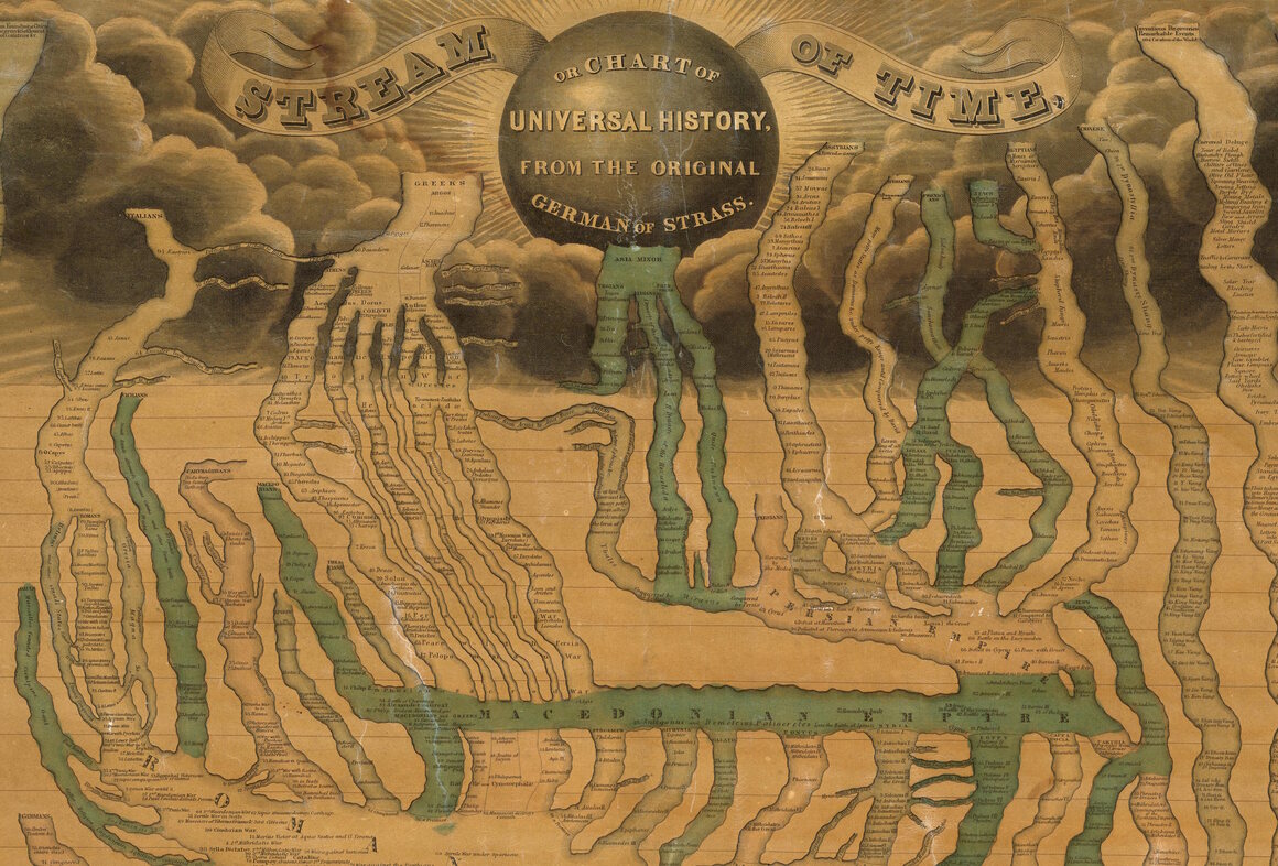
This flowchart-style map wasn’t the only one of its kind. Colton’s diagram bears a striking resemblance to Friedrich Strass’ 1803 Der Strom der Zeiten; in fact, he based his work off of it.
 Friedrich Strass’ 1803 map, which inspired Colton.
An important alteration for Colton, however, besides the German-to-English translation, was the addition of the budding history of the young United States, his mother country and the home of his mapmaking company.
A more serpentine timeline predating Colton’s, created by Emma Willard in 1836 and called “Picture of Nations,” has the same general structure, this time focusing more on the creation and dissolution of states and empires. A bursting ray of light at the year 0 indicating the birth of Christ is much more salient than words “Jesus Christ” Colton put in capital letters and boldface.
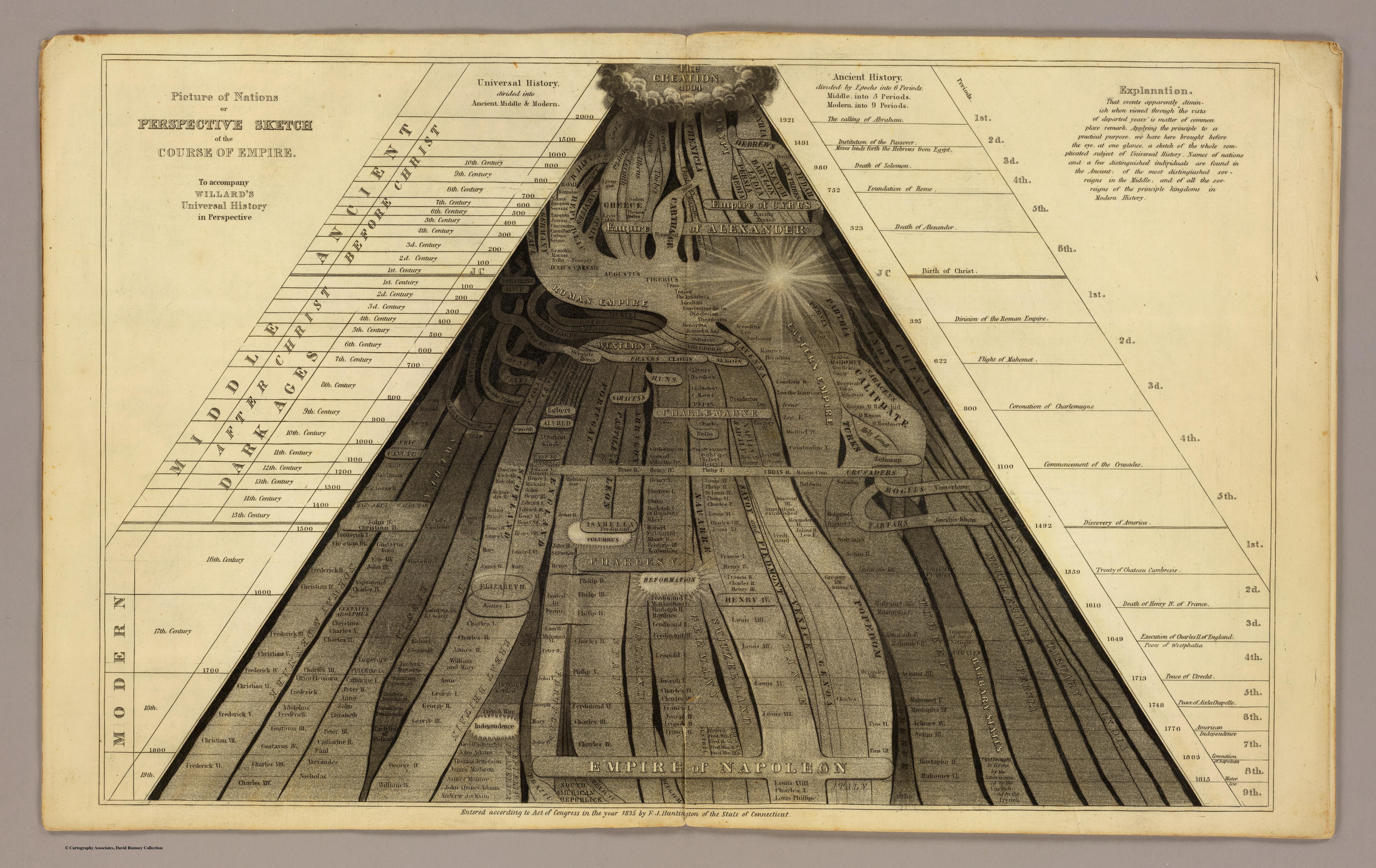 Emma Willard’s 1836 historical flowchart, highlighting the rises and falls of empires.
But it didn’t stop there. In 1858 a Frenchman named Eugene Pick created his own version, titled Tableau De L’Histoire Universelle (Eastern Hemisphere) reflecting Colton’s design, this time with an abundance of color and vignettes of famous landmarks, buildings, and scenes.

 A vignette from Pick’s map showing the Egyptian sphinx.
All of these maps and more can be found at the David Rumsey Map Collection database and blog.
Map Monday highlights interesting and unusual cartographic pursuits from around the world and through time. Read more Map Monday posts.







Follow us on Twitter to get the latest on the world's hidden wonders.
Like us on Facebook to get the latest on the world's hidden wonders.
Follow us on Twitter Like us on Facebook