Traveling Back in Time With Colorful Isochrone Maps
Journey-based charts from the past can help us track the progression of transportation technology.
In the early 1880s, the mapmaker Francis Galton (best known today for his unfortunate work in eugenics) began to imagine a series of ideal trips.* Each started in his home city, London, but from there they ranged far afield—to Greenland, or Morocco, or the distant reaches of the Pacific. By figuring out how long each of these trips would take, and drawing lines grouping those destinations that could be reached in an equal amount of time, he figured he could provide a service to travelers, sailors, and those who simply wanted to know how long it would take their mail to get someplace.
Galton’s calculations presumed smooth sailing all the way: “I assume the seasons to be favorable, that immunity has been obtained from political obstructions, and that friends on the spot have made preparations to avoid delay,” he wrote. For each trip, he consulted steamer timetables, estimated package-shipping times, and personal correspondence from friends at the Post Office. He then sorted the destinations into different color groupings—everywhere one could get to between ten and 20 days was yellow, for example, while everything that took more than 40 days to reach was brown.
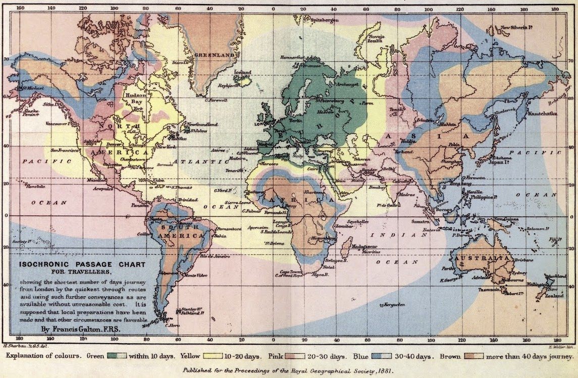
When he was done, he’d come up with a splashy yet practical one-look travel guide: the first example of what he called an “Isochronic Passage Chart.”
At the time Galton released his map, isotherms and isobars—lines that group areas exhibiting equal temperature or atmospheric pressure—were already a well-established part of weather mapping. The applications of Galton’s concept to travel and postal delivery times caught on quickly. Mapmakers across Europe began coming out with their own isochrone maps, based in different cities and pitched at different scales.
Many of these maps look like the insides of jawbreaker candies: a ribbon of color at a continent’s coast is quickly replaced with another, and then another, as travel becomes more difficult the further inland one goes.
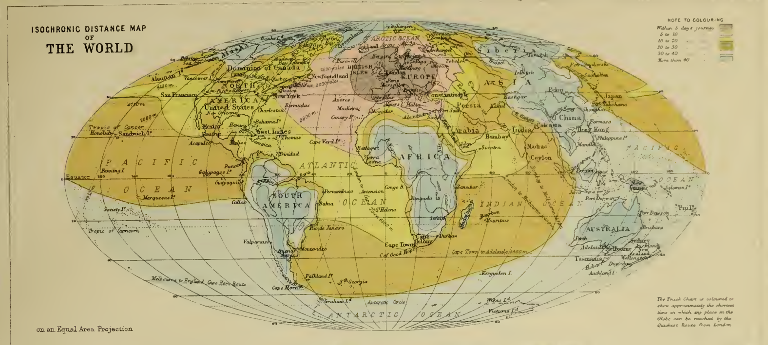
The above 1889 map, by J.G. Bartholomew, is also centered on London but superimposed on an equal-area projection.
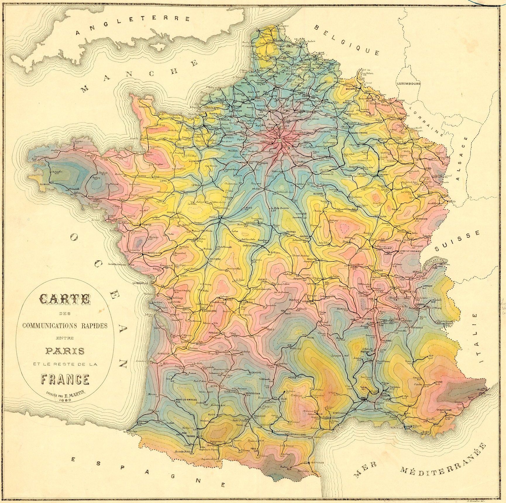
Now compare it to Bartholomew’s 1914 update, below, which shows a rapid improvement in travel times, at least in certain places—parts of Japan are now accessible within 20 days, and the pink-colored “five to ten days” category, which previously barely stretched to New York, now goes all the way past Chicago. (The big difference, as Simon Willis explains in The Economist, is the sudden proliferation of railroads.)
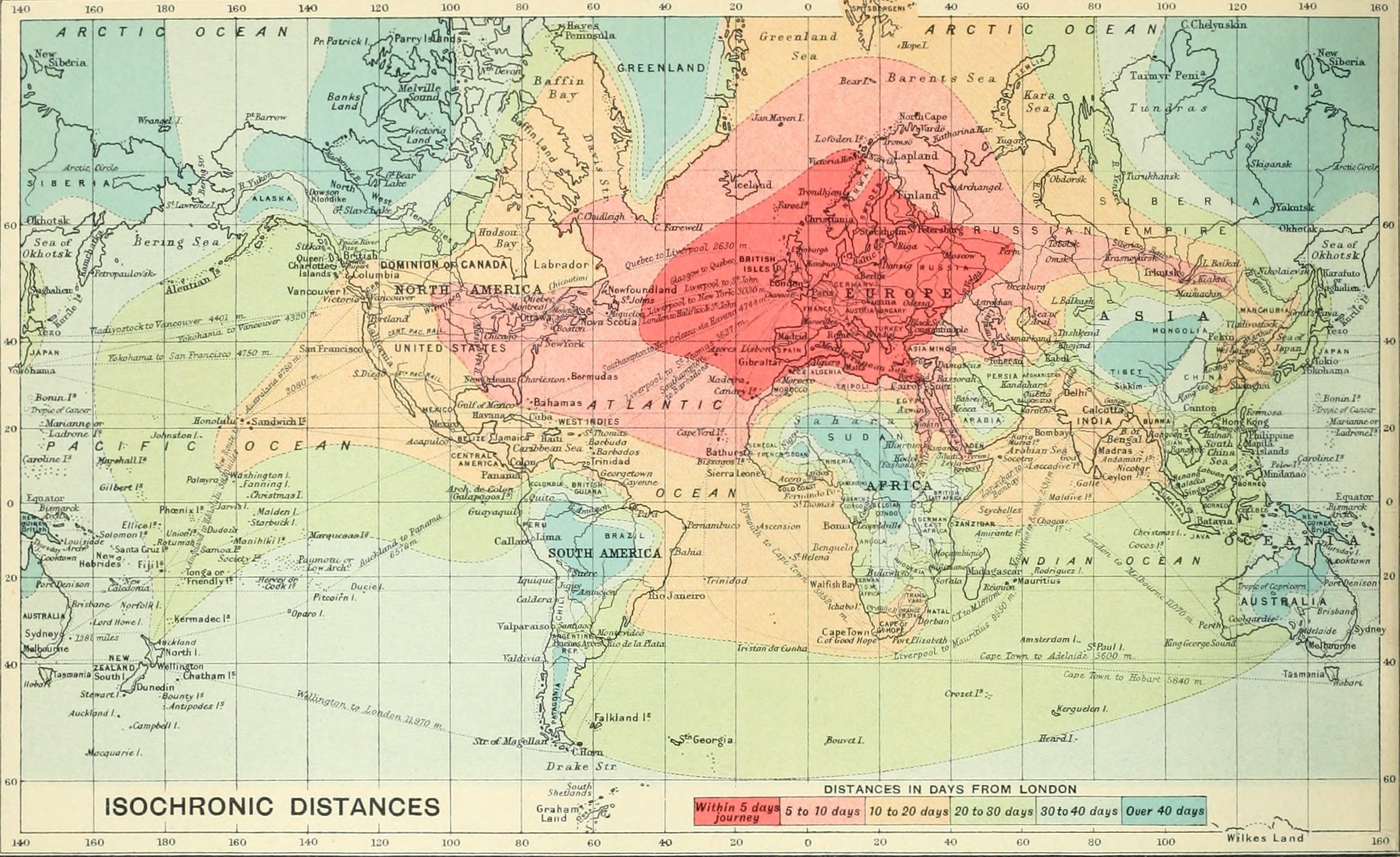
In each of the London-centric maps, Australia remains far out in the blue zone, perpetually 40-plus days away. But make it there, and you’d find they were using isochrone maps of their own. One, from the early 20th century, shows how the railroads cut down travel time in and out of Melbourne.
The map’s “Minimum Railway and Tramway Time Zones” are measured in minutes, not hours, and the stations themselves are warm-colored hotspots in the middle of cooler, slower zones.
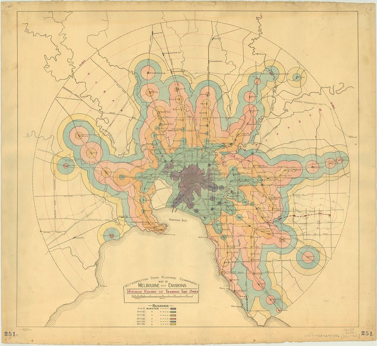
Just as contemporary readers used these maps to imagine future trips, we can use them to travel back in time—to think about what journeys looked like before there were quite so many transportation options available.
Map Monday highlights interesting and unusual cartographic pursuits from around the world and through time. Read more Map Monday posts.
*Update 1/23: This post has been updated with more information about Francis Galton.









Follow us on Twitter to get the latest on the world's hidden wonders.
Like us on Facebook to get the latest on the world's hidden wonders.
Follow us on Twitter Like us on Facebook